 EN
EN  PT-BR
PT-BR FR
FR ES
ES DE
DEProduct Update
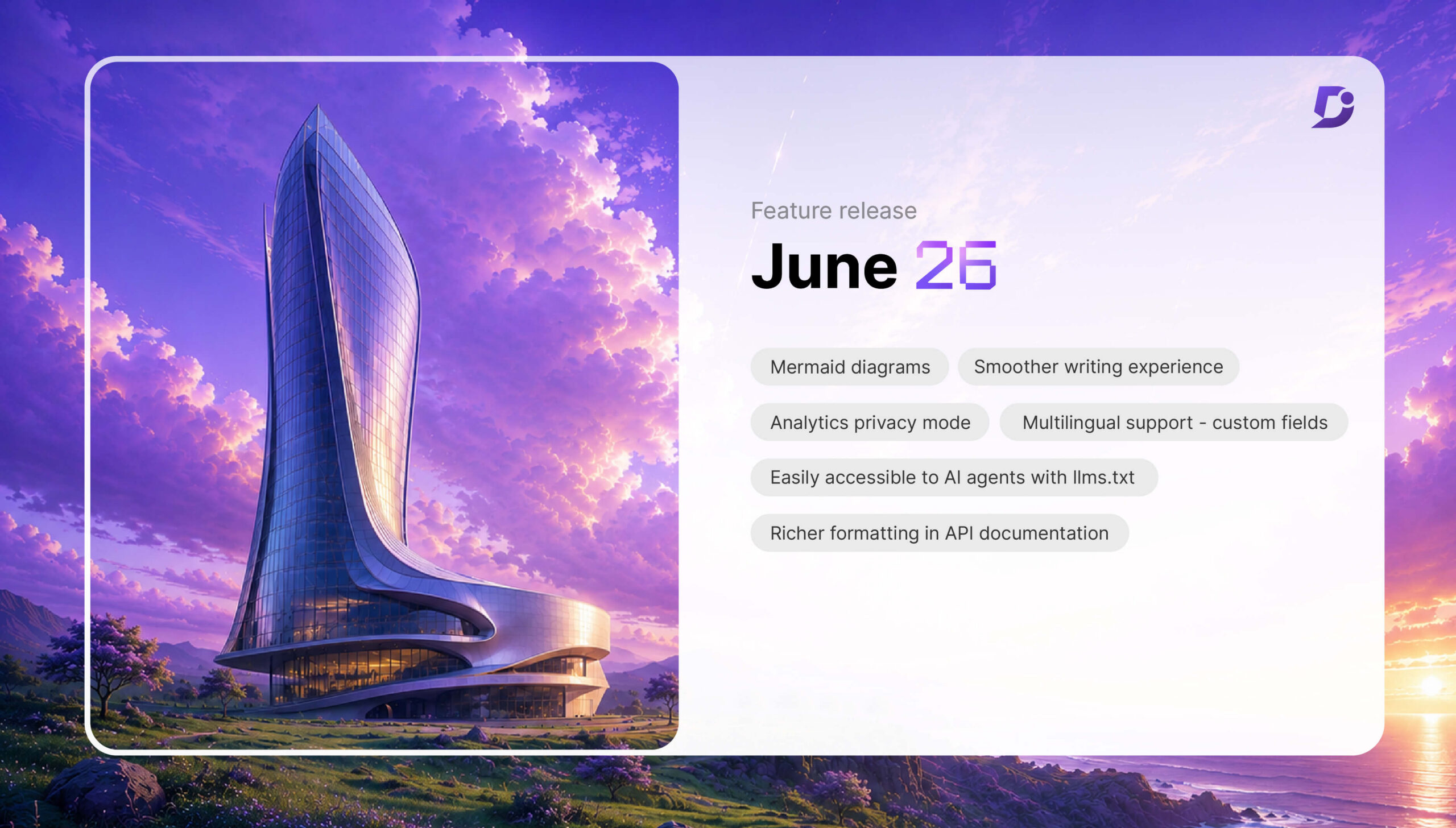
Create Visual Documentation for Humans, Optimize It for AI D...
Jun 29, 2026 • Darshan Sureshkumar
Your documentation now has two readers. There’s a person searching for an answer, …
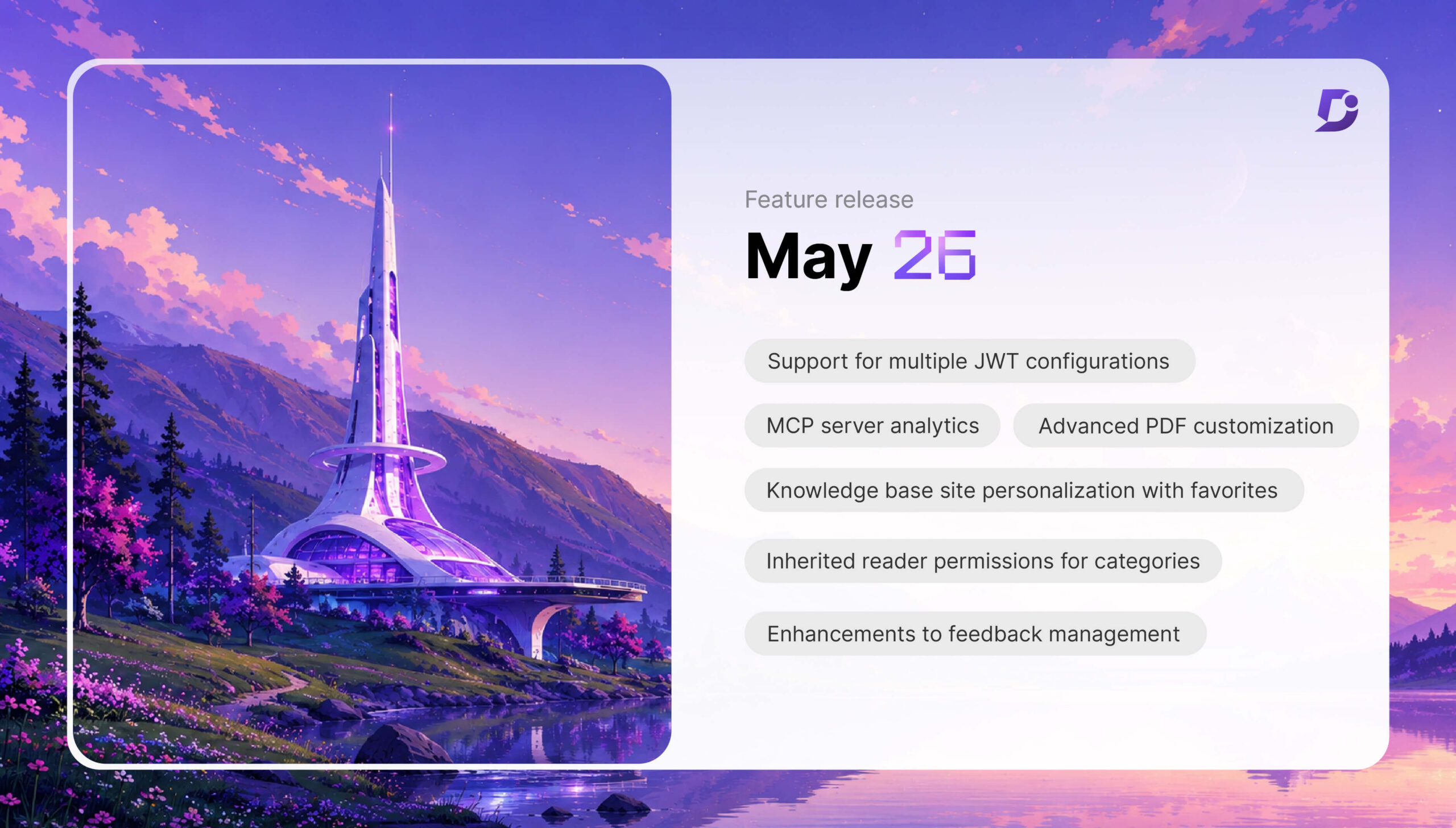
The Enterprise Guide to Knowledge Base Authentication and MC...
Jun 1, 2026 • Darshan Sureshkumar
Document360’s May updates are built around a growing reality in modern documentation where …
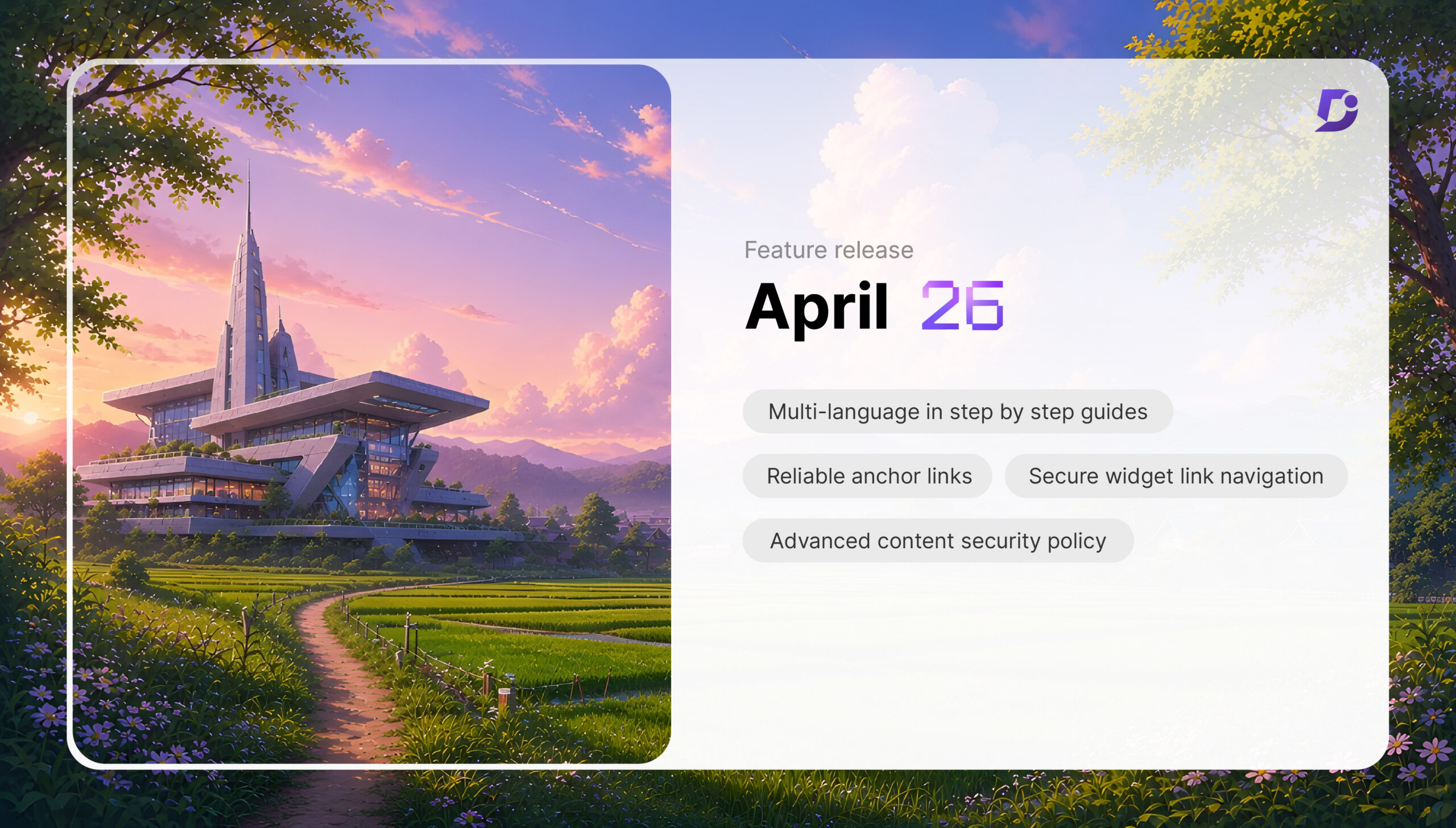
Scale Your Knowledge Base With Stronger Security and Multili...
Apr 30, 2026 • Shobhana Settu
Document360’s April updates bring solutions that help you tackle the persistent challenges documentation …
Knowledge Base Automation: Custom Fields, SCIM Provisioning ...
Apr 3, 2026 • Jenolin Johnson
There’s a particular kind of frustration that quietly builds as teams grow. Not …
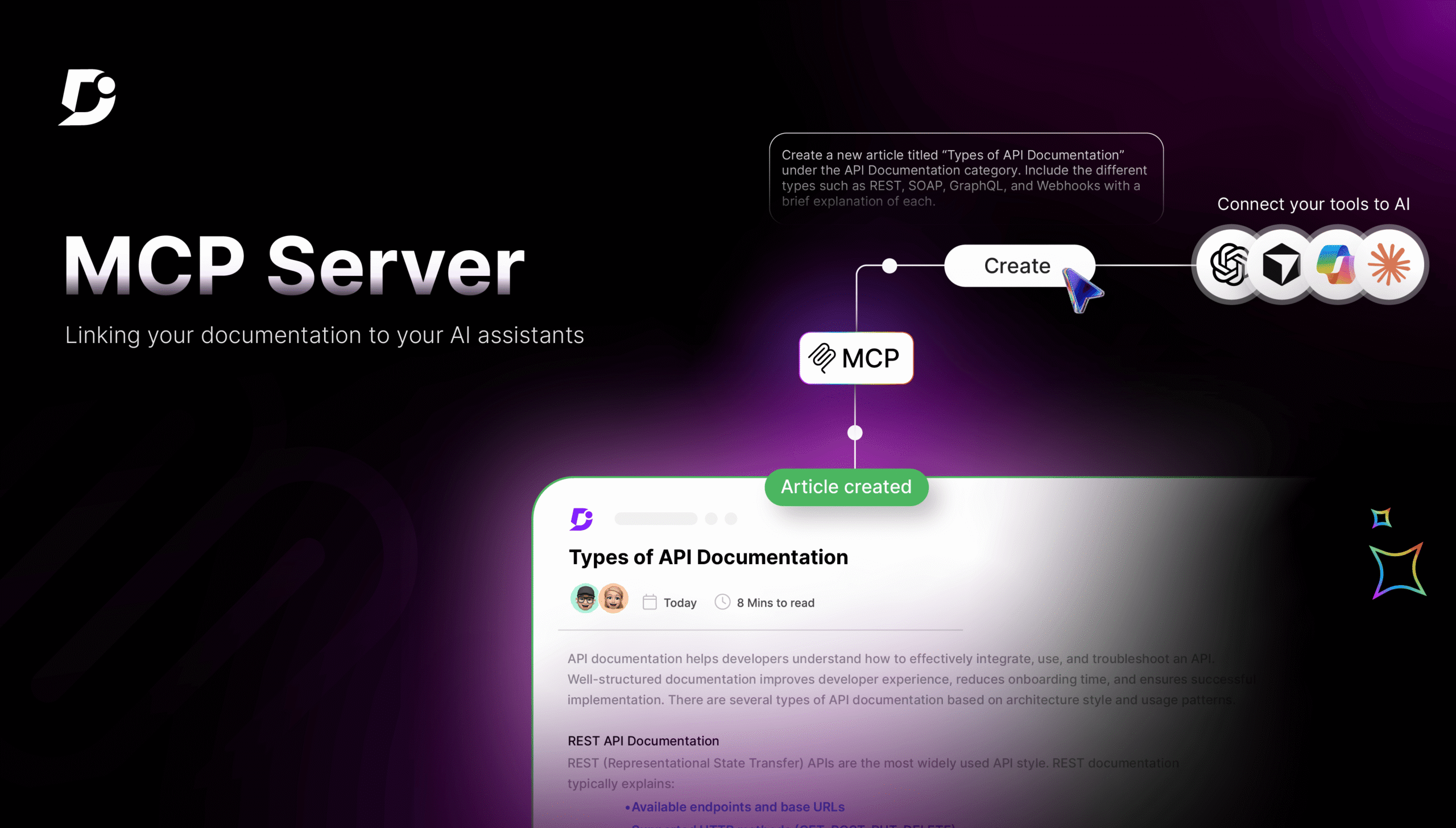
How MCP Servers Unlock Your Documentation for AI Assistants
Mar 30, 2026 • Jenolin Johnson
Every technical writer knows what documentation tax is, even though it’s a cost …
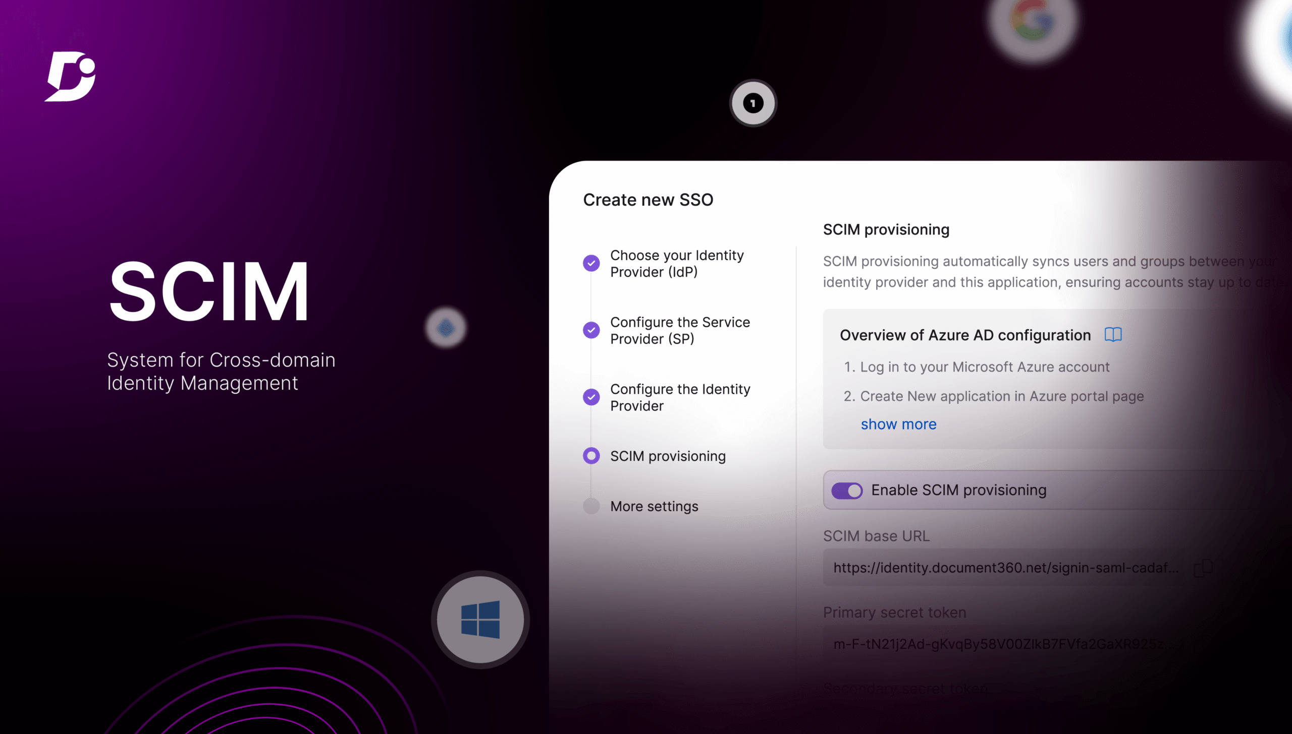
How SCIM Automates User Access in Document360 Knowledge Base
Mar 28, 2026 • Sophia Prince
Imagine you are an IT administrator at a fast-growing organization, handling large teams. …
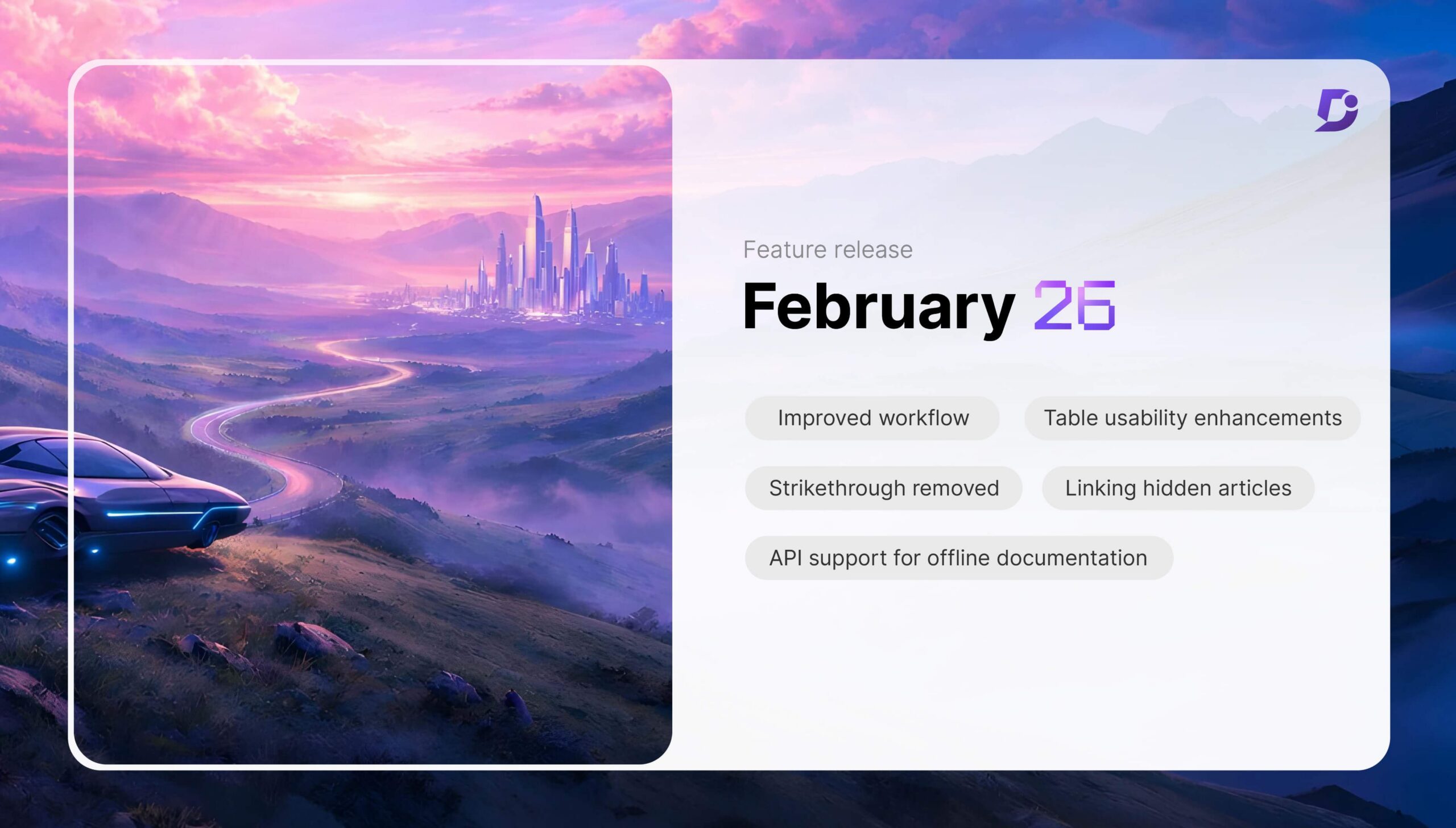
February 2026 Updates: Multi-user Workflow, Improved Tables ...
Mar 9, 2026 • Jenolin Johnson
February may be the shortest month of the year, but it delivered meaningful …

Introducing Eddy AI Chatbot: Turning Documentation into Seam...
Feb 5, 2026 • Jenolin Johnson
Do you remember what it was like to try to train a chatbot …
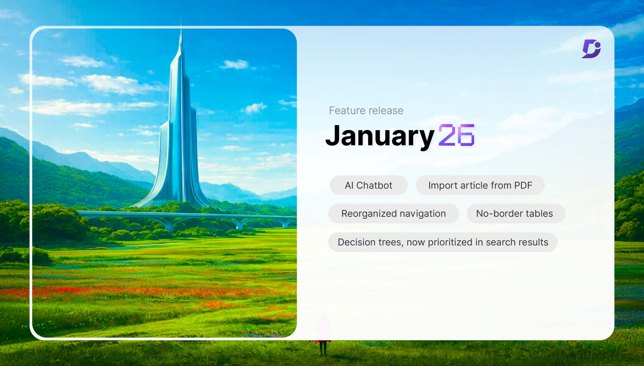
Starting 2026 with Exciting New Features: January Release Up...
Feb 2, 2026 • Janeera
January always arrives with a sense of possibility. A new year, new beginnings, …
