Do you want to enhance your knowledge base user experience? Want to know what the knowledge base best practices are that can help you do that?
In the rare case that you still do not have a knowledge base, here are two out of many reasons why creating a knowledge base is not an option but a necessity in today’s times.
- 70% of customers prefer to use a company’s website to get answers to their questions rather than use phone or email.
- An average office employee invests about 20% of his or her work time in researching internal information. That is to say, one day out of the five days he is working, one whole day is spent looking for information!
A knowledge base is the central repository of all the organizational knowledge that not only gives customers what they want in the form of a 24×7 self-service hub but also saves that precious 20% of your employees’ time that is currently getting wasted.
However, creating a knowledge base is not enough; designing it well, managing it well, and using the information it provides to make improvements are as important. In other words, ‘knowledge management’ by following knowledge-base best practices is the key, and this is exactly what we are going to discuss in detail in this post.
Let’s get started!
Planning and Strategy
Define Goals and Audience
For your knowledge base to be successful, you must understand the problem that you are trying to solve by building it in the first place.
Is your team overwhelmed by increasing support tickets, or has employee onboarding and training become an uphill task? Or are you facing any other business-specific challenge or a mix of them? Who do you want to make your knowledge base for: internal teams, customers, or both?
Here are some sample goals for a knowledge base:
- Increase customer retention by 20% by enhancing customer experience
- Reduces support tickets by 25% by implementing AI-powered responses for common queries
- Reduce hold time by 35% by providing a centralized hub with call scripts
Once your goals and audience are clear, you can proceed to choosing the right knowledge base type.
Choosing the Right Knowledge Base Type
Depending on the goals and audience you want to build your knowledge base for, you must choose to build one of the following:
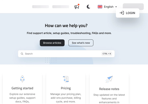
External knowledge base: The knowledge base you create for your customers is called an external knowledge base, and it can serve various goals, from enhancing customer satisfaction and retention to providing accessibility beyond borders and time zones. Help centers, FAQ pages, and an AI-powered search with detailed articles are examples of an external knowledge base.
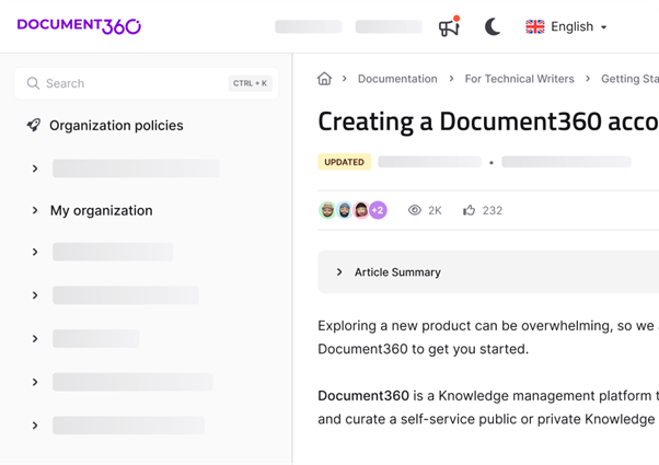
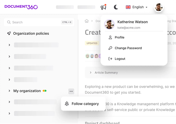
Internal knowledge base: The knowledge base you create to support your teams is called an internal knowledge base. Whether you are trying to increase your collaboration rates, reduce internal queries, or efficiently onboard and train your employees, an internal knowledge base is your answer. Such a knowledge base can be in the form of FAQ pages, employee support portals, SOPs, or a mix.
Mixed knowledge base: When you have both internal and external audiences and goals to satisfy, you can go for a mixed knowledge base. There is dynamic knowledge base software that gives you the functionality to achieve this smoothly and efficiently.
Content Creation Best Practices
Use Clear and Concise Language
Keeping the language simple and to the point while customizing it to your target audience is the best strategy for the maximum number of people to understand your knowledge base. It also enhances acceptance, as anyone looking for a solution prefers an easy-to-follow language.
Also, you may put enough relevant content out there, but the audience still doesn’t find answers because your knowledge base is not optimized for search. To avoid this, use keyword-rich titles and proper tags to optimize searchability.
Customizing slugs, which are each article’s unique ID, is also important for better search engine rankings and a superior user experience.
Add Visuals and Interactive Elements
Visual content not only breaks the monotony of text but it tops text content in engagement, assimilation, and memorability. So, including them in your knowledge base is an effective strategy for success.
Using visual aids like imagery and videos, along with interactive content like forums and quizzes, can elevate the user experience of your knowledge base. From passive consumers, users become active participants, which helps you keep your knowledge base updated and constantly evolving.
Such content is crucial for businesses where products/services are too technical or complex. For example, if you are a SaaS business, video tutorials, infographics, and step-by-step interactive guides should be your go-to tools to explain complex concepts by breaking them down into smaller pieces and helping users visualize what needs to be done.
Knowledge Base Design Best Practices
Organize Content with a Clear Structure
Imagine a restaurant that had all the food you wanted but no menu. You’d be lost, right?
Putting all your content out there without organizing it is the same experience for your users. To consume your content effectively, you must organize it into broad topics and subtopics and give it an overall structure with a top-down approach.
Some key pointers to achieve a good structure in your knowledge base are:
- Pick a layout that best suits your content
- Group articles like “Troubleshooting,” with subgroups such as “Account Setup”
- Use specific titles like “How to Set Up Two-Factor Authentication” instead of generic ones like “Security.”
- Add breadcrumbs like “Home > Getting Started > Account Setup.”
The key is to keep the flow of content intuitive and logical with easy-to-use menus.
Include a Powerful Search Function
Including a powerful search function optimized for filters and sorting choices is a must to make a truly successful knowledge base. By enabling users to find what they want with lightning-fast speed, you can also skyrocket your user experience and satisfaction.
Ensure it is easy to use and fits the screen of various devices. Making it intuitive with the power of AI is a bonus, as the AI gives auto-suggestions even before your audience can type the full keyword and solves the problem faster.
Implementing User Feedback Mechanisms
Once your knowledge base is up, you need to assess its performance and make corrections where needed. And who better to ask than your end users about this? So, including feedback mechanisms in your knowledge base design is crucial during the design phase itself.
Surveys, feedback forms, and comment sections are a few mechanisms you can use to receive constant feedback from your users.
Remember seeing ‘Was this article helpful’ at the end of a lot of content you consume with one thumb up and one down? That is the most popular and common way of doing it as it takes almost no time and is more like an invitation for an opinion, and we all love to give opinions.
Other easy-to-implement feedback mechanisms include a WhatsApp button, email address, or phone number so customers can reach out at their convenience.
Integrate with Other Tools
Integrating your knowledge base with the tools your teams are already using turns it into a powerhouse to overcome business challenges in any area you want.
For example, if you are facing the challenge of a very high resolution time in your chat center, the solution is to provide your chat agents with quick access to relevant information by integrating your knowledge base with the chat client.
You can also integrate your knowledge base with your CRM, employee onboarding and employee training & development software, etc.
Schedule a demo with one of our experts to take a deeper dive into Document360
Book A Demo
Maintaining the Knowledge Base
Regular Content Audits and Updates
Once your knowledge base is up and running, maintaining it is as important as creating it.
A content audit is a routine check that tells you if your content is helpful, relevant, and accurate and if something is missing.
Ideally, it should happen monthly, but it may not be practical unless you have a full-time team to do it. So, metrics like traffic and helpfulness ratings can be checked monthly along with a quarterly or half-yearly detailed audit.
Depending on the audit results, you must keep updating the content that will tremendously help your search engine rankings too.
Measuring Success and Optimization
KPIs to Track
The KPIs you must track for your knowledge base are tied closely with its goals, but some common key performance indicators to keep it optimized and help you measure its success are:
- Page visits
- Top visited articles
- Bounce rate
- Failed searches
- Survey responses, and
- Last update dates
Leveraging Analytics
Use the feedback you collect with the feedback mechanisms you have put in place to see what’s popular, what is effective, and what is not working.
This can help plug knowledge gaps, keep what works front and center, and refine what already exists.
Analytics can also help you identify areas and instances where audiences find it difficult to access information, enabling you to fix those and improve user experience.
Knowledge Base Examples
Gong
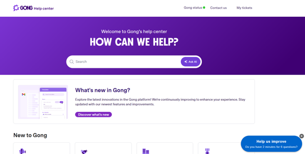
Gong is a great example of a well-built knowledge base that gives clear topics and subtopics for users to get started, use, and configure Gong with easy-to-read articles. On top of their knowledge base, they have a search button for a quick start, a community to interact with, and an academy to further learn about Gong.
Insider
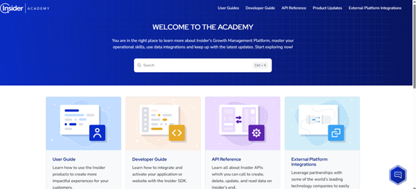
One of the best customer engagement platforms out there, Insider puts all the necessary help to start using and making the most of it right in front. They also lay down a set of the most popular topics to help users save time while referring to their knowledge base for the most common issues that may arise.
ClickFunnels
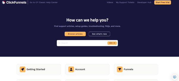
A state-of-the-art funnel builder, ClickFunnels places all relevant topics right in front, along with an article library, search bar, and What’s new button on top. They also have video tutorials, communities, and remarkable categories like the ‘recently modified articles’ to help clients get the latest information.
Why Document360?
Document360 is a dynamic AI-powered knowledge base software that allows you to store, manage, and share your organizational knowledge in one central hub while providing advanced functionalities such as:
- AI-powered search and AI assistant Eddy help customers perform Google-like searches. The AI assistant provides contextual answers to reader queries and even prompts them with suggestions and answers beforehand.
- Category Manager works like a folder that contains a group of related content, allowing you to organize high volumes of content by dividing it into categories and sub-categories.
- Version Control allows you to monitor all the changes made in your documents, ensuring your customers find the latest versions.
- Advanced Analytics provides insight into discrete levels of analytical data, like views, search queries, and geography. You can use these analytics to improve existing content and add what is missing to serve your audiences better.
- In-built SEO Tools help you optimize your knowledge base for search engines, driving traffic to your KB and improving discoverability for your audience.
▶ Check out our video with Cloudflare’s Caley Burton on building strong content operations and tackling content debt.
Wrapping Up
I hope this article helped you identify best practices you can implement to enhance your user experience and create a knowledge base in case you haven’t yet. I wish you all the best!
Join the thousands of industry leaders who trust Document360 for their documentation needs. Start your free trial now!
GET STARTED
Frequently Asked Questions
-
How can I improve the usability of my knowledge base?
To optimize usability, keep the content in a central repository, make it easily accessible, optimize for search and scalability, and keep the content simple and consistent across channels.
-
What type of content should be included in a knowledge base?
Include content that closely aligns with your knowledge base goal. Some common knowledge-based content types are FAQs, user guides, video tutorials, company information, etc.
-
How often should a knowledge base be updated?
A knowledge base must be updated quarterly or at least every six months.
-
How do I write effective knowledge base articles?
Effective knowledge base articles are highly user-relevant, easy to read, to the point, and linked contextually to provide more information where needed. Also, always follow a style guide to maintain consistency.
-
Should a knowledge base be public or private?
This depends on your knowledge base goal, you can make a public, private, or mixed knowledge base.
-
How can I measure the effectiveness of a knowledge base?
By performing regular content audits, measuring KPIs, and using built-in analytics.



 –
– 
