Site Builder is one of the most loved features of Document360, where you can design your home page, header, footer, custom error pages, and the core documentation page layout. In this article, let’s take a deep dive into the front-end tech exploration of Document360’s Site Builder.
Sneak peek into the UX flow of Site Builder
To familiarize yourself with the user flow, let’s begin by building/designing a home page using the site builder in Document360.
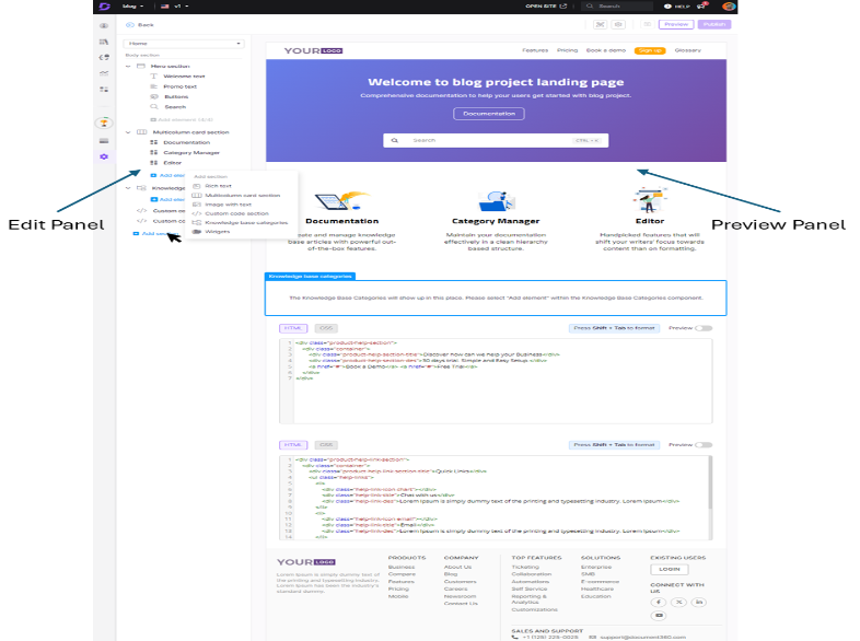
The site builder has two panels: the edit panel on the left side and the preview panel on the right side.

|
Left Panel |
Right Panel |
|
|
Data-Driven Component Rendering
Users can build a complete dynamic web page that can be customized in thousands and thousands of ways. The interesting part of this experience is the data structure, where the whole page is represented as a tree structure and mapped to a nested Angular Reactive Form.
It is like a browser DOM object; we call it UIElement.
Data Structure:
TypeScript:
	export interface UIElement {
		elementType?: ElementTypes | string;
		elementName?: string;
		displayName?: string;
		viewProperties?: UIElementPropeties;
		viewStyles?: UIElementPropeties;
		children?: UIElement[];
	}

	export type UIElementPropeties = {
		[key: string]: string | boolean | number;
	};
Example Data:
The below example is a data representation of the hero section on the home page.
JSON:
	{
		"elementType": 5,
		"elementName": "heroSection",
		"displayName": "Hero section",
		"viewStyles": {
			"backgroundStyles": "background-image: linear-gradient(135deg, rgb(102, 126, 234) 0%, rgb(118, 75, 162) 100%)",
			"noCover": false,
			"alignment": "center"
		},
		"viewProperties": {
			"draggable": false,
			"hidden": false
		},
		"children": [
			{
				"elementType": 18,
				"elementName": "headingTextElement",
				"displayName": "Welcome text",
				"viewStyles": {
					"color": "#ffffff",
					"size": "H1"
				},
				"viewProperties": {
					"draggable": false,
					"hidden": false,
					"text": "Welcome to blog project landing page"
				}
			},
			{
				"elementType": 20,
				"elementName": "textAreaElement",
				"displayName": "Promo text",
				"viewStyles": {
					"color": "#ffffff"
				},
				"viewProperties": {
					"draggable": false,
					"hidden": false,
					"text": "Comprehensive documentation to help your users get started with blog project.",
					"isColorDirty": true
				}
			},
			{
				"elementType": 13,
				"elementName": "groupClickableElement",
				"displayName": "Buttons",
				"viewStyles": {
					"textColor": "#ffffff",
					"buttonColor": "#ffffff"
				},
				"viewProperties": {
					"draggable": false,
					"hidden": false
				},
				"children": [
					{
						"elementType": 14,
						"elementName": "clickableElement",
						"displayName": "Buttons",
						"viewProperties": {
							"draggable": false,
							"hidden": false,
							"type": 3,
							"url": "/docs",
							"text": "Documentation"
						}
					}
				]
			},
			{
				"elementType": 19,
				"elementName": "inputTextboxElement",
				"displayName": "Search",
				"viewProperties": {
					"draggable": false,
					"hidden": false
				}
			}
		]
	}
Here you can see the Hero Section has 4 children, HeadingTextElement, TextAreaElement, GroupClickabeElement, and InputTextBoxElement.

All these elements have two Angular components – one for preview and another for editing, like HeadingTextElementComponent and HeadingTextElementEditComponent.

The edit element automatically reflects in the preview panel when a change is made. In the next section, we will see how this is achieved using the Angular Reactive form.
Angular Reactive Form – ControlContainer
This section talks more about the implementation. To understand further we need a basic knowledge of Angular Reactive form. As the whole page is represented as data, let us see how this tree-structured data is converted to Angular Nested FormGroups and how it is mapped with its Components.
Below is the data representation of the HeadingTextElement, which contains the text to be displayed stored in viewProperties.text, and the customizable color is stored in viewStyles.color.
JSON:
	{
		"elementType": 18,
		"elementName": "headingTextElement",
		"displayName": "Welcome text",
		"viewStyles": {
			"color": "#ffffff",
			"size": "H1"
		},
		"viewProperties": {
			"draggable": false,
			"hidden": false,
			"text": "Welcome to blog project landing page"
		}
	},
In the code below, the method getUIElementFormGroup recursively creates the root Angular formGroup object, including its children array as formArray (array of formGroups) .
TypeScript:
	public getUIElementFormGroup(element: UIElement): FormGroup {

		const pageBodyFormGroup = this.fb.group({
		  elementType: element.elementType || '',
		  elementName: element.elementName || '',
		  displayName: element.displayName || '',
		  viewProperties: this.fb.group(element.viewProperties || ''),
		  viewStyles: this.fb.group(element.viewStyles || ''),
		  elementGUID: element.elementGUID || CreateGUID(),
		  children: this.getUIElementChildrenFormArray(element.children),
		  editableProperties: this.getEditablePropertiesChildrenFormArray(element.editableProperties),

		});
		return pageBodyFormGroup;
	  }

	  public getUIElementChildrenFormArray(children: UIElement[]) {
		if (children) {
		  const childrenFormArray = [];
		  children.forEach((element: UIElement) => {
			childrenFormArray.push(this.getUIElementFormGroup(element));
		  });
		  return this.fb.array(childrenFormArray);
		} else {
		  return this.fb.array([]);
		}
	  }
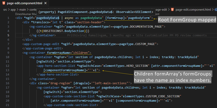
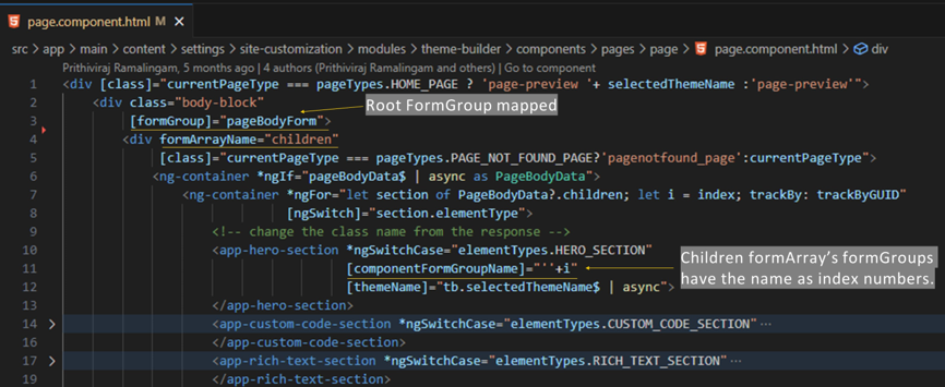
The above-said root formGroup variable is mapped as pageBodyForm in the PageComponent template, which is the root component in the Right preview panel. Also, the same pageBodyForm is mapped in the PageEditComponent template, which is the root component in the left edit panel.
Thus, it is shared between the two root components. The formControl is wired to the input elements in edit type components and the formGroup valueChanges is subscribed in the preview type components to reflect the changes.
The ControlContainer service of angular reactive form is injected in each child component to access the parent form group and its value without explicitly passing it to the child components.
|
Left Edit Panel Root Component PageEditComponent |
Right Preview Panel Root Component PageComponent |
|
|
|
Conclusion
Thus, a complex Site builder application can be built with the powerful Angular Reactive Forms which is very clean, data-driven easily scalable, and maintainable. The advantage over the other ways like building with ngRx store / RxJs observables as state management, is that Angular reactive forms handle it seamlessly and effectively. Angular reactive forms easily accommodate user input data validation and other criteria or rules.


 –
– 

