 EN
EN 
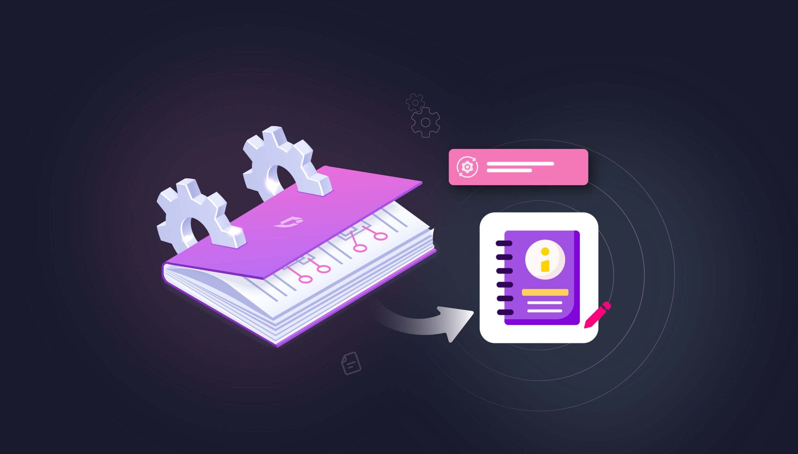
📝 TL;DR
Most teams treat the user manual as a deliverable. The ones getting the most out of it treat it as part of the product. Done well, it cuts support load, gets new customers to value faster, and gives your reader a way out of a problem at 2 am without opening a ticket.
- Organize around jobs, not menus. Readers don’t think in terms of your navigation structure. They think in terms of what they’re trying to get done.
- Write for the scanner. Descriptive headings beat elegant prose. Your reader landed here because something broke.
- Hand it to a stranger before you ship. The writer always knows too much. Someone who has never used your product will find the gaps in ten minutes.
- Mine the ticket queue. Your top ten recurring tickets are the table of contents you should actually be writing.
- Maintain it like you maintain production code. Out-of-date docs aren’t neutral. They mislead, and they generate more tickets than missing docs.
- Pick software for your workflow. Team size, update frequency, and output formats decide this. Not feature checklists.
The user manual is one of the most under-invested assets in business. Not because teams don’t care. Most care. The problem is that it sits between product, support, and marketing, so nobody quite owns the outcome. And when nobody owns it, it drifts.
The cost of that drift is measurable. McKinsey puts it at nearly 20% of a knowledge worker’s time spent hunting for information internally. That is roughly a full workday a week. Panopto estimates that it maps to $47 million in lost productivity per year at a large enterprise. The customer-side number is just as stark. Salesforce data says 61% of customers prefer self-service for routine questions, and 80% of high-performing service organizations offer self-service against just 56% of low performers. Someone on your team is paying the cost of a weak manual. Usually support, sometimes onboarding, often both.
This guide is for the people who actually write them: technical writers, product managers, support leads, and customer success managers. It covers what we have seen work across Document360 customer rollouts and where teams tend to get stuck.
User Manual vs User Guide: The Difference That Actually Matters
A user manual is the full reference. Every feature, every config, every weird thing that can go wrong. It is where someone goes when something is unusual, when they need the spec, when Google led them to your docs because they typed the exact error into the search bar.

A user guide is narrower. Task-oriented, walks you from A to B, ignores everything that is not on that path. The two words get used interchangeably in most content calendars, but they produce different documents, for different readers, in different states of mind. If you do not decide which one you are writing, you end up with something in the middle that works for neither.
|
| User Manual | User Guide |
| Purpose | The canonical reference | Help with one specific job |
| Scope | Every feature, spec, and procedure | A narrow set of common tasks |
| Depth | Exhaustive. Assume someone will search for anything. | Just deep enough to finish the task |
| Tone | Precise. Slightly formal. | Direct. Sometimes conversational. |
| How it is read | Pulled up, searched, and quoted from | Read top-to-bottom in one sitting |
| Mental model | A road atlas | Turn-by-turn GPS directions |
Most products need both. The manual is your foundation: searchable, complete, kept up to date. The guide is the front door for people who have just bought the product and do not want to read everything to get started.
The User Manual You Need Depends on the Product
Not all manuals do the same job. The one a marketing ops lead needs to configure lead scoring looks nothing like the one a fleet manager needs to service a forklift. Before you decide on structure or tooling, pick the type (or types) you are actually building.
| Type | What It Does | Best For |
| Knowledge Base | Searchable articles with versioning, analytics, and in-app embedding. The default for most modern SaaS. | SaaS products. Self-serve customers. |
| Instruction Manual | Linear setup, assembly, or operation. Visuals do a lot of the work. | Physical products and hardware |
| Training Manual | Structured for learning a skill, not looking up a fact. Usually has exercises. | Employee onboarding and internal enablement |
| Quick Start Guide | Ten pages or ten minutes. Gets the user to their first meaningful action, nothing more. | SaaS onboarding, consumer hardware |
| SOP Manual | Exact sequences. Approvals. Audit trails. | Regulated industries, ops teams, anything with compliance |
| Service / Maintenance Manual | Upkeep routines, service intervals, parts replacement procedures. | Machinery, fleet, appliances |
If you are shipping a product, the safe starting set is an online knowledge base plus a quick start guide. Physical product? Add a service or safety manual. What you want to avoid is the thing where a team tries to stuff setup, troubleshooting, admin, and API reference into one monolith. Nothing in that document ends up good.
How to Create a User Manual Your Customers Will Actually Use
Eight phases. We have seen teams skip any one of them and regret it later, usually within the first quarter after launch, when the support volume they expected to drop does not.
Phase one: pick one reader and write to them
Obvious advice. Consistently ignored. Most manuals fail because the writer wrote for a blurry average of every possible reader, and therefore served none of them well.
Before you touch a blank page, name the reader. What is their role? Is this day one, or month seven? Did they choose the product, or did someone hand it to them on a Monday morning? What does a successful outcome look like? And what do they do for a living when they are not using your product?
An API reference for platform engineers needs auth flows, rate limits, and code you can paste. A marketing dashboard manual needs screenshots, plain-English metric definitions, and an explanation of what each number changes when it moves. Same product. Completely different docs. If your SaaS serves three personas, you probably need three entry points into the manual, or at a minimum, honest audience tags on every section so readers know when a page is not for them.
Phase two: start from the ticket queue, not the product tour
This is where most manuals lose their reader. Teams organize content around the product’s own nav (Settings, Dashboard, Integrations, Admin) instead of around the jobs a customer is trying to finish. Nobody opens a manual looking for “Settings.” They open it because they want to wire up Slack, change who gets a notification, or turn on SSO before Tuesday’s audit.
Organize by job. Start from the first login, follow the reader through their most complex workflow, and write each job as its own article. First action after sign-up. First sticking point in week two. The question support gets asked fifty times a month. That fifty-times-a-month question is your most important article.
Ticket data is where the structure comes from. Pull your last ninety days of tickets, cluster by root cause, and sort by volume. The top ten clusters are your table of contents. PMs can tell you what shipping is; support can tell you what is breaking; neither one alone gives you the full map.
Phase three: design for the scanner, not the reader
Nobody sits down with a cup of tea and reads a user manual. People land on a page from a search result, scan for a heading that matches their problem, and read only that section. Structure for that behavior.
- Top-level sections map to phases of use. Onboarding, day-to-day features, integrations, admin, and troubleshooting.
- Sub-sections are jobs inside those phases. “Create your first project,” “Turn on SSO,” “Configure role-based access.”
- Articles cover exactly one job. If two jobs share a page, split them. One URL, one outcome.
Headings should say what the reader will learn. “How to export data as CSV” is a heading. “Export options” is a gamble. Anyone scanning a table of contents needs to know what is behind the link before they click. Readers who have to guess file tickets instead.
Phase four: write like you are walking someone through it over Zoom
Every article follows the same shape. Context first (when and why you would do this). Prerequisites (what has to be true before the user starts). The actions themselves, one per line. Then a confirmation: what the user should actually see on screen when it worked.
Weak: “Go to settings and configure your preferences.”
Better: “Click the gear icon, top-right. Select Notifications. Toggle Email alerts to On. You will see a green confirmation banner for about two seconds.”
The second version tells the reader where, what, and how to know it worked. That is the bar. A manual that meets it gets bookmarked. A manual that does not get screenshotted and sent to support with the question “Is this right?”
Phase five: every screenshot earns its place, or it does not go in
The Nielsen Norman Group famously found that 79% of users scan web pages instead of reading them, and that concise, scannable writing improved measured usability by 58%. A well-placed visual helps a scanner orient in seconds. A badly placed one adds weight and nothing else.
Screenshots do their job when they show something words cannot. A gear icon is buried three menus deep. A visual workflow with branching paths. An annotated error states that a user can compare against what they are seeing on screen. A short Loom walkthrough for a setup that involves bouncing between three tabs.

A screenshot of a text field with the label ‘Name’ next to it? No. Delete it. The test: if removing the visual would not confuse anyone, it should not be there in the first place.
One warning most teams learn the hard way: screenshots age fast. If you are shipping UI changes every two weeks, a library of three hundred screenshots turns into a maintenance liability within a year. Short videos and simplified diagrams often outlast pixel-perfect captures. Plan for the refresh cycle before you commit to the format.
Phase six: for anything complicated, write the numbered walkthrough
Bullet points do not cut it for multi-stage work. Integrating with a CRM. Migrating data from a legacy tool. Rolling out SSO across a thousand-seat tenant. Each of these earns its own numbered walkthrough with a dedicated article, its own QA pass, and its own analytics.
For numbered guides, every line starts with a verb. Click. Select. Paste. Confirm. Tell the reader what they should see before you send them onward. If a known failure mode exists, flag it in a callout. Do not bury a warning inside body copy. A disturbing share of failed tenant migrations we have audited comes down to a single overlooked warning line.
The test is simple. Someone with no context, following the article alone, lands on the right outcome. If they cannot, the walkthrough is not done yet.
Phase seven: hand the draft to someone who has never seen your product
Writers drown in the curse of knowledge. They skip an action because it is obvious to them. They use an internal codename without noticing. They assume a reader knows what a webhook does. Fresh eyes fix this faster than any checklist.
Before launch, pick someone who has never touched the product and give them a task. “Set up an account, connect your first integration, and import a sample dataset, using only the docs.” Sit next to them. Say nothing. Watch where they hesitate. Watch where they ask a question out loud. Every question is a gap in the manual.
Pay special attention to the moments they stop reading and start clicking around. That is where your manual is failing. Fix, test, then ship. Customer success is a great partner for this. CSMs watch new users struggle every day, and they can either run the test themselves or rope in a recent customer who is happy to trade ten minutes for a small credit on their invoice.
Phase eight: ship it, measure it, keep it alive
A manual that was accurate in Q3 last year and has not been touched since is actively working against your support team. Features get renamed. Workflows change. UIs move a button from left to right. If your docs do not keep pace, readers follow outdated instructions, fail, and open a ticket. That ticket is worse than silence, because the user now does not trust the product either.
Bake maintenance into the workflow. Watch what people search for inside your docs. The top ten queries tell you what is missing or hard to find. Look at articles with high traffic and low satisfaction; those are the ones to rewrite next. Every time the product ships a change that affects the user, the release checklist includes a docs update. Not a Slack message. A checklist line item with an owner.
Treat docs the way your engineers treat production code. Version them. Review them. Retire what is wrong. A manual with an owner and a quarterly review cadence outperforms a manual maintained by last-minute heroics, every single time.
Find out how Document360 helps reduce support tickets and improve self-service.
Book A Demo
Picking User Manual Software Without the Feature-Grid Theatre
There is no universally best tool. There is one that fits your team size, your output formats, and your update cadence. Short version of how the main options compare, without a feature grid:
Document360

A knowledge base platform built for teams and customers. Document360 combines a WYSIWYG and Markdown editor with a category-based hierarchy designed specifically for structured documentation. Teams build user manuals using reusable snippets, content variables, and conditional publishing to serve multiple product versions from a single source. A built-in review workflow routes drafts to the right approvers before publication, while version control and change history let writers roll back safely. Localization management supports multilingual manuals without leaving the platform. Readers benefit from AI-powered search, breadcrumb navigation, and embeddable in-product help widgets. Integrations with Slack, Jira, and Intercom connect documentation to the tools support and product teams already use daily.
Paligo

Paligo applies Component Content Management System principles to user manual authoring, storing every topic as a reusable XML component rather than a flat page. Writers assemble manuals by combining topics, then apply conditional profiling to publish separate outputs, web, PDF, and print—from the same source without duplicating content. Branch-based release management lets teams maintain documentation for multiple product versions simultaneously. Structured authoring enforces consistency across contributors, reducing style drift in large manuals. Paligo’s translation memory integration sends only changed segments to translators, cutting localization costs and turnaround time. Role-based permissions and audit trails give managers visibility into who changed what and when.
Mintlify

Mintlify targets teams that author documentation close to the codebase, supporting Markdown and MDX files committed directly to a Git repository. Writers use reusable component blocks and shared snippets to maintain consistency across long user manuals without repetitive edits. Every push to the connected repo triggers an automatic deployment, keeping published content in sync with the product. Customizable themes and custom domain support let teams brand their manuals to match product design guidelines. Built-in analytics surface which pages receive the most traffic and where readers drop off, helping writers prioritize updates. An AI writing assistant accelerates first drafts and suggests improvements in line.
MadCap Flare

MadCap Flare is a desktop-first authoring tool built around XML-based structured content and single-sourcing for technical documentation at scale. Writers create topics once, then reuse them across multiple user manuals using snippets, variables, and condition tags that control what each audience or product version sees. Flare’s multi-channel publishing generates responsive web output, PDF, and print-ready formats from the same project. Micro-content authoring supports knowledge-panel search results alongside full manual pages. A built-in translation memory connects directly to localization workflows, and detailed project reports track content status across large contributor teams. Import support for Word and FrameMaker simplifies migration from legacy documentation systems.
GitBook

GitBook organizes user manuals into spaces and collections that mirror product structure, making navigation intuitive for both writers and readers. Teams author in a clean block-based editor that renders Markdown natively, lowering the barrier for non-technical contributors such as support leads and product managers. Git Sync keeps documentation aligned with repository branches, enabling docs-as-code workflows where manual updates ship alongside feature releases. Inline comments and suggestion mode let reviewers annotate drafts without overwriting content, streamlining the approval cycle. Visitor authentication and space-level permissions control access to internal or customer-facing manuals. Search indexes content across all spaces, helping readers locate answers without navigating the full manual hierarchy.
For a bootstrapped team or an open-source project, Markdown plus Docusaurus or MkDocs is genuinely fine. The important part is not the tool. It is whether the tool supports search, versioning, and the output formats your customers actually ask for. Docs locked in a single format age badly. So do teams that cannot update them.
▶️ Check Out How to Create a User Manual with Document360
Five Patterns That Keep Showing Up in Manual Audits
When we audit a customer’s existing manual before migration, the same handful of problems show up again and again. None of them is exotic. All of them are expensive.
Grouping by your nav, not the reader’s job
Your product’s menu tree is not a reader’s mental model. If the top-level category of your manual matches the top-level item in your app’s sidebar, that is a smell. Readers come in with jobs. Organize around jobs.
Writing for someone who already knows the product
If your article says “simply configure the endpoint parameters” and half your readers are marketers, you have lost them in the first sentence. Translate. Where a technical term has to stay, define it on first use. The word “simply” almost always hides an assumption the reader cannot make.
No visuals, or visuals everywhere
Both are mistakes. A wall of text makes readers work. A screenshot of every input field makes a page slow and fragile. Pick the three or four moments in an article where a picture saves a paragraph, and put the picture there.
Publishing once and walking away
A manual that has not been touched in a year is generating tickets. Customers read it, follow the steps, hit a screen that does not match, and file a ticket blaming the product. The doc is now actively destroying trust. A manual missing that page would have been less damaging.
Ignoring what the ticket queue is telling you
Your support team already knows where your manual is weakest. If five question types account for 40% of inbound tickets, those five topics belong at the top of the rewrite queue. Build around real confusion, not around the feature list the PM hands you.

