It’s crucial to develop a well-rounded knowledge base for your ecommerce store. We discussed in a previous article the reasons why.
A knowledge base is a self-service portal that your customers can use to find answers to their most common queries, and today’s customers expect you to provide them with readymade answers at their fingertips. Imagine a customer is about to make a purchase on your site, and has a question about shipping, but you have no knowledge base. This customer is likely to abandon their cart rather than wait for a support agent to answer their question.
70% of customers now expect a self-service portal on your website. The most important part of the customer experience is a fast response time, and a knowledge base offers instant service. They don’t want to wait around for an agent to give them an answer they could have found themselves. “In the world of Internet Customer Service, it’s important to remember your competitor is only one mouse click away,” says Doug Warner, former chairman of the board of J.P. Morgan & Co. Customers want information, and they want it now.
If you invest in a knowledge base for your ecommerce store, you’ll be in good company. Now let’s look at some examples of well-known ecommerce company knowledge bases.
1. Amazon
Amazon is the king of ecommerce, where you can buy anything from a lawnmower to lingerie. 89% of customers say they are more likely to buy products from Amazon than any other online retailer. It’s the world’s largest online retailer, and it would be impossible for Amazon to respond to every single customer query without the use of their knowledge base.
Amazon has a simple knowledge base broken down into sections that relate to the most popular queries. Each section has a clear graphic to help customers scan the knowledge base for the right information.
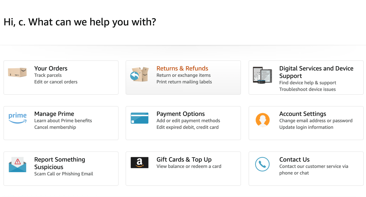
Of course, there are many more questions that customers may have and Amazon deals with these further down their knowledge base.
Amazon makes use of a prominent search bar to encourage customers to discover content. They’ve included the most common queries in a simple list format to discourage customers from contacting support. Most of what customers need answers to can be found in the Amazon knowledge base. Amazon has also provided useful video tutorials to educate customers in some common actions.
2. AliExpress
AliExpress is an ecommerce company based in China. They ship to customers around the world. With their knowledge base, they’ve given the search bar prominence just above a list of Frequently Asked Questions (FAQs). It’s not the prettiest knowledge base in the world but it basically caters to customers looking for answers to common questions.
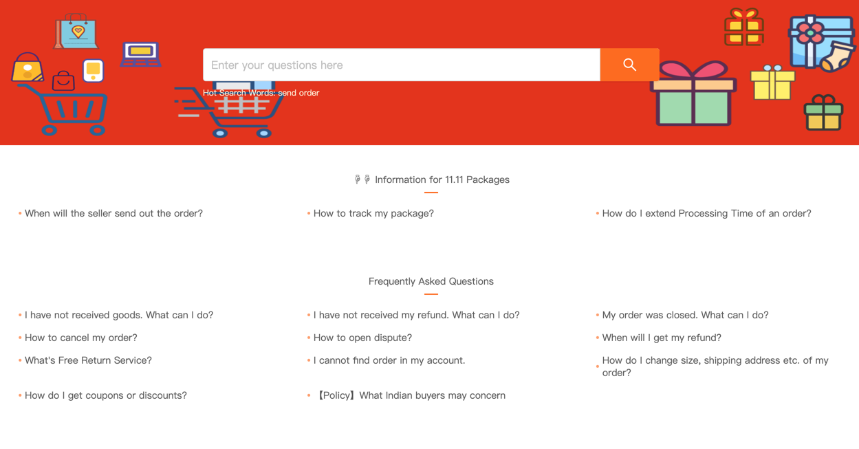
Lower down, AliExpress has a table filled with categories so customers can browse content. It’s a very simple knowledge base focused on managing customer orders.
3. eBay
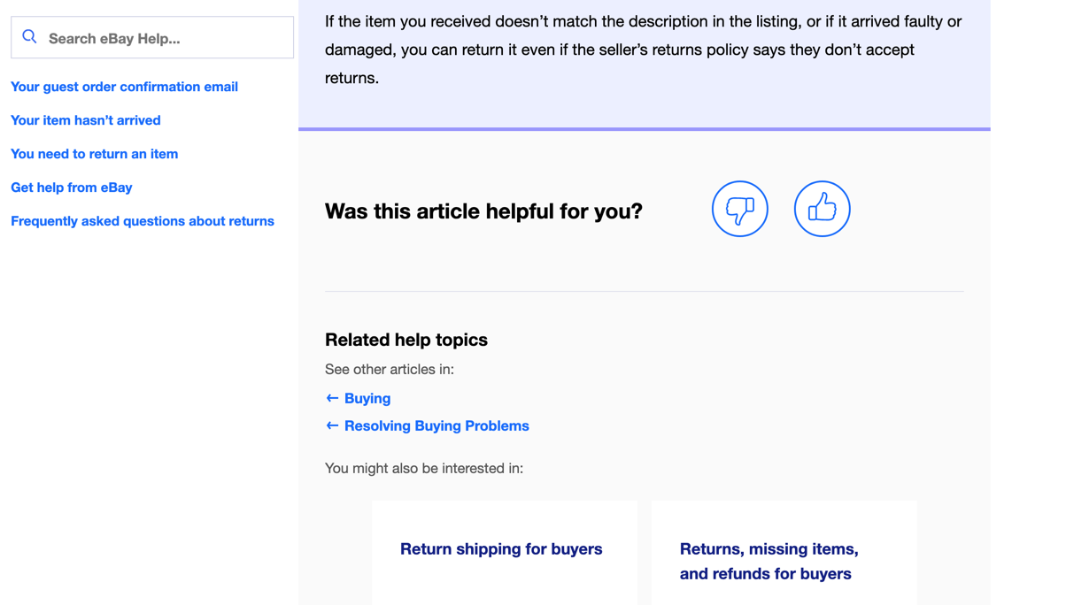
eBay is a Californian ecommerce company that ships around the world. They have a very well-designed knowledge base catering to their customers. First of all, we see the search bar, and then a list of popular articles.
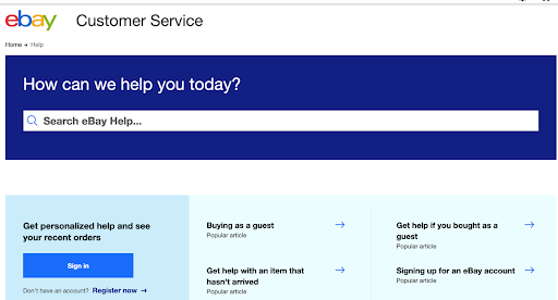
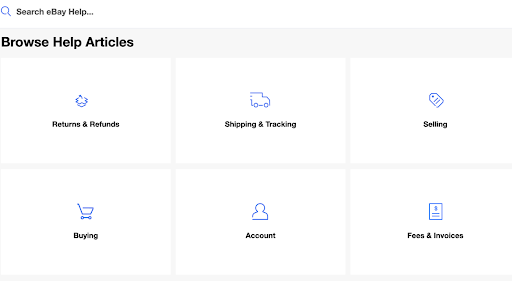
Then eBay has a list of help categories that customers can use to browse for information. It’s clear and to the point. The search bar remains stuck to the knowledge base so that at any time customers can search for what they need.
eBay offers very detailed articles on the process of using eBay for new customers. At the end of the article eBay asks customers to rate if the article was helpful or not, and suggests related help topics.
4. Zappos
Zappos is an American ecommerce retailer for shoes and clothing. Zappos has gone for a literal list of FAQs, which we don’t recommend. There is no way for the customer to easily search the content, and they are required to scroll down a long list of questions in the hope that they may find the answer to theirs.
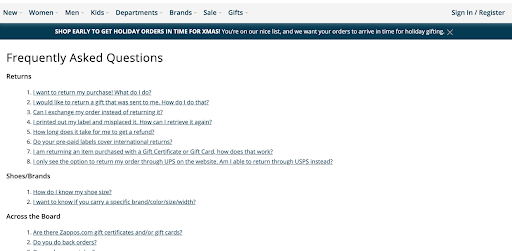
Zappos is strongly focused on human customer support, and provides the number to call their service line on every page. In the future, Zappos might want to think about investing in a fully-fledged knowledge base to better serve their customers.
5. ASOS
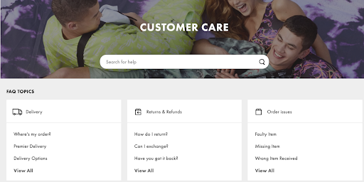
ASOS is a British ecommerce fashion and cosmetics company that ships globally. ASOS has gone for the standard design of placing the search bar right at the top, then listing common FAQ topics just underneath. Customers will find it easy to browse this knowledge base.
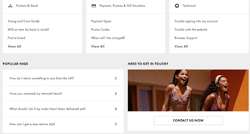
At the bottom ASOS has listed popular FAQs for customers who are likely to have the most common queries, and a quick link to contact customer support. It’s really important to give customers a way to contact a live human, no matter how much you invest in your knowledge base.
6. Instacart
Instacart is an American online grocery delivery service. They open their knowledge base with the most popular articles listed. The search bar is right up top so customers can search for their query with ease.
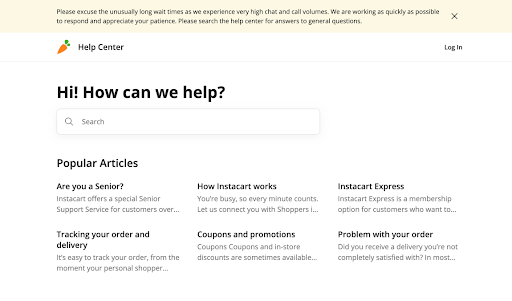
If you scroll down then Instacart lists the major content categories for their knowledge base, each one symbolised by a bright icon. One criticism you could make of Instacart is they don’t make it easy to contact an agent online if the customer can’t find the answer to their question.
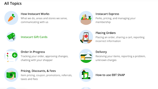
The ability to get more help is hidden down at article level, but Instacart does provide dedicated support for senior customers.
7. Rakuten
Rakuten is a Japanese electronic ecommerce company. They’ve set up their help centre with a very clean design, listing the most common questions at the top. Unfortunately, there is no search bar to help customers quickly find what they need.
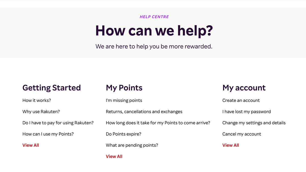
Rakuten have provided an online contact form for customers who require information that is not held in the knowledge base. Rakuten might want to think about expanding their content so customers can find more answers through self-service. Many customers are not going to bother going through the effort of filling out a form if they just have a quick question about a refund policy.
8. Wayfair
Wayfair is an American ecommerce company that sells furniture and household goods. They’ve laid out their knowledge base in an interesting way, with a list of common self-service actions at the very top. Then comes the search bar, and a list of customer help topics.
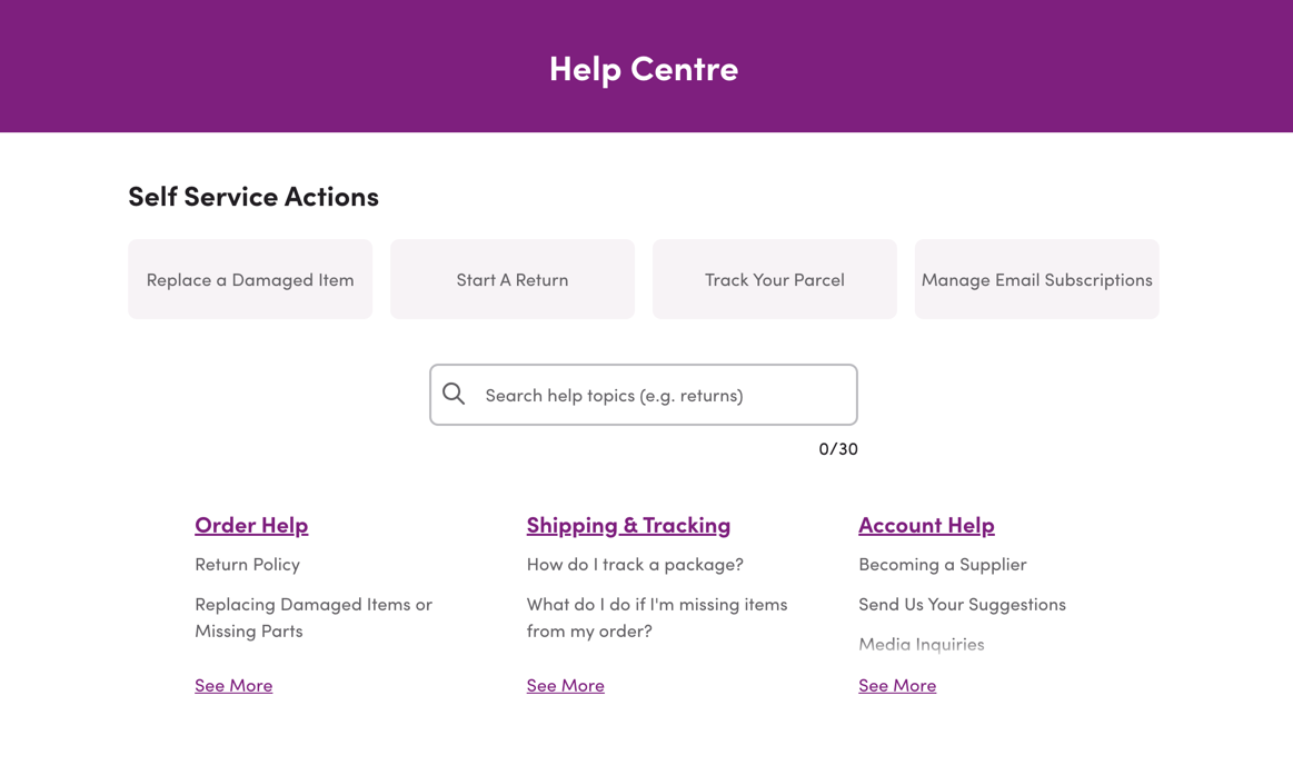
Wayfair has clearly invested in their knowledge base and they also provide an easy way to contact customer support at the bottom of the page. Wayfair couldn’t really do better with their knowledge base.
9. Zalando
Zalando is a European ecommerce fashion retailer. They offer a simple knowledge base first listing the most viewed questions but encouraging customers to log into the site to receive more personalised help.
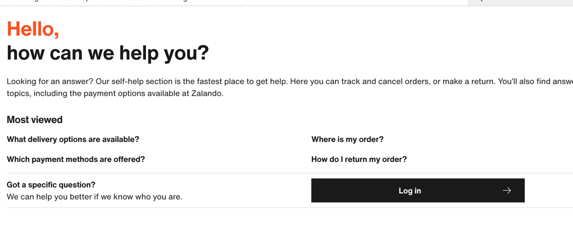
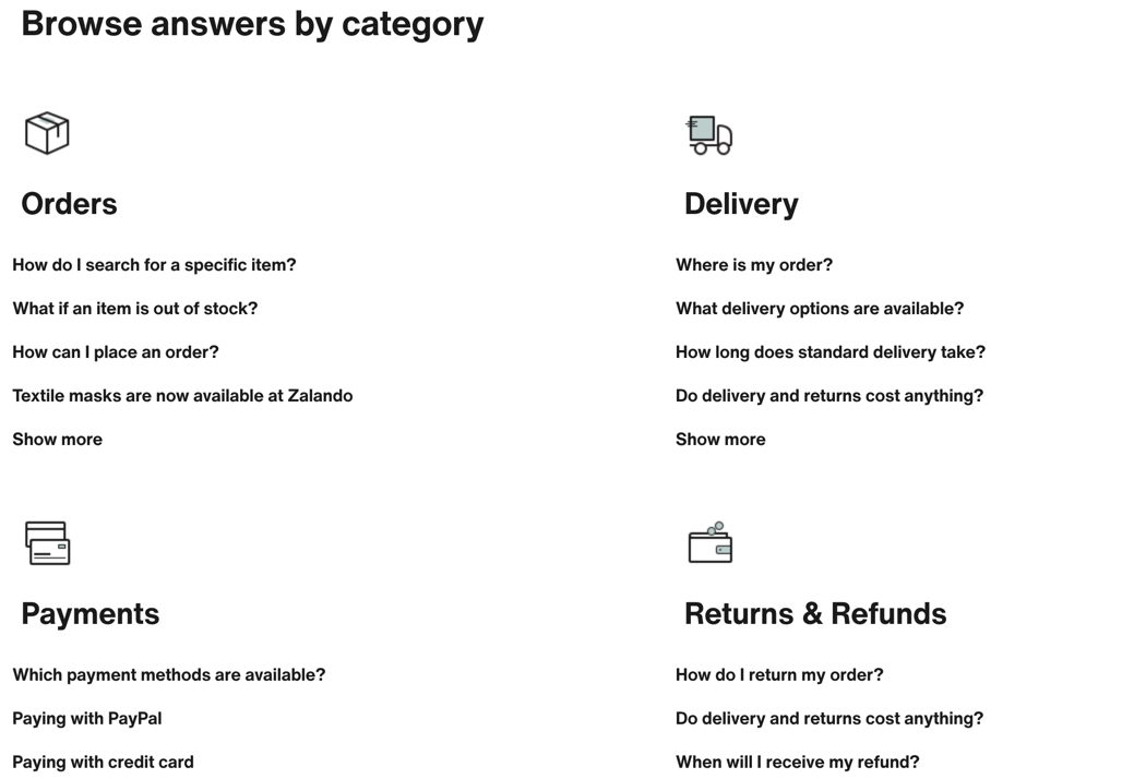
Customers can also browse answers by category, but there is no easy way to contact customer support if the answer isn’t found in the knowledge base. Zalando should think about providing a quick contact option to avoid customer frustration and churn. Similarly, adding a simple search bar to the site will also help customers to find what they need faster.
10. Fanatics
Fanatics is an American ecommerce sports apparel retailer. They offer a basic knowledge base displaying the categories of help content. Each section leads to a page answering the most common queries relating to that topic. A plus side of this help centre is the option to chat with an agent prominently featured.
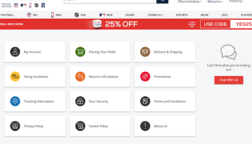
Fanatics might want to think about offering a widget with the most common queries listed on the first page, and also to add a search bar for customers seeking a quicker answer to their question.
11. Chewy
Chewy is an American pet products retailer. Like Zappos, their knowledge base consists of a list of Frequently Asked Questions, which isn’t the best knowledge base design. The page is extremely long and likely to put off customers searching for a quick answer to their question.
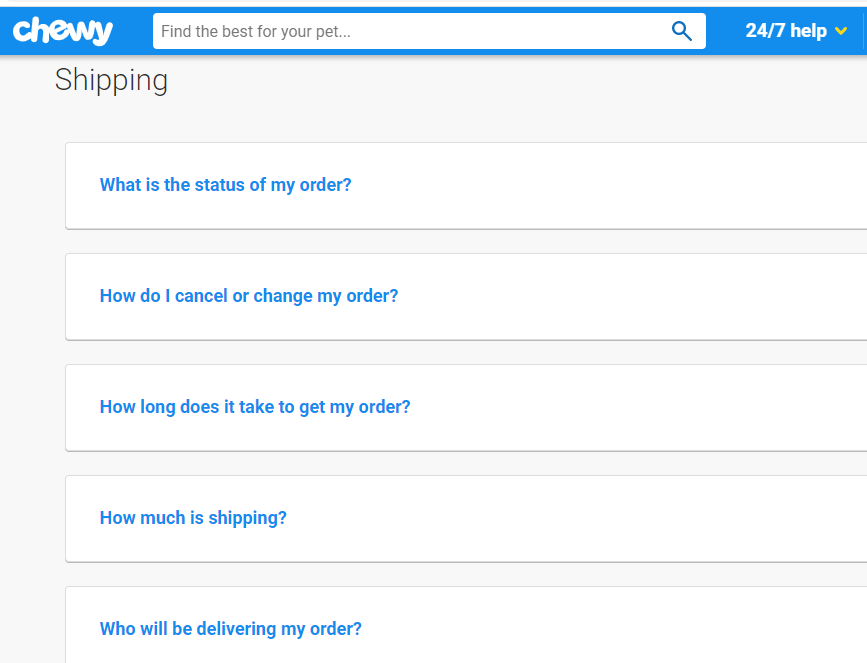
Chewy is likely to want customers to contact their agents, as they provide their contact number on every page. There’s nothing wrong with pushing customer support but Chewy could save on their support costs if they invested in the User Experience of their knowledge base.
Also, Check out our blog on Knowledge management in the Retail industry
Final remarks
You can’t afford to miss out on an ecommerce knowledge base – 40% of customers now prefer self-service over human contact. Follow the example of these companies and develop a help centre that caters both to search, and to browsing. Customers are likely to already be frustrated by the time they reach out for help so you must make it easy for them to find the answers they need.
Also Read: Top 8 ECommerce Customer Service Best Practices to Follow
It’s not enough to provide a list of FAQs as this is likely to annoy the customer more than help them. There’s no excuse not to invest in a fully-fledged knowledge base when the top ecommerce brands are leading the way with their help centres.
An intuitive knowledge base software to easily add your content and integrate it with any application. Give Document360 a try!
Get Started


 –
– 

