EN
EN  PT-BR
PT-BR FR
FR ES
ES DE
DE
Keeping documentation organized, accurate, and easy to navigate isn’t just “the writer’s problem.” It’s a daily challenge for every team that manages and uses a growing knowledge base. Writers manage varying priorities across articles, reviewers lose track of workflows, and readers are often derailed while navigating across versions.
With this release of Document360, we’re tackling those pain points head-on. This release focuses on helping teams to manage tasks easily, reuse content effectively, organize publishing, and facilitate a frictionless reading experience.
Let’s walk through what’s new and why it matters.
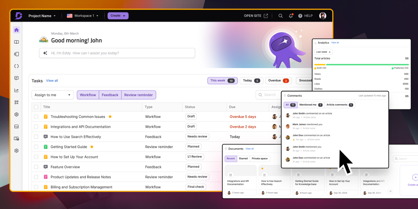
Start Your Day Right With The New Overview Dashboard
If you’ve ever started your day staring at your documentation portal, wondering “What do I tackle first?”, you’re not alone. For many teams, knowledge management feels like navigating a maze without directions. You know the things you need are somewhere, but review reminders keep popping up. Someone is waiting for feedback that you didn’t even see. Analytics are buried in a corner, and the last article you edited is already forgotten under the pile.
At Document360, we aimed to solve that chaos, not by presenting you with another menu to navigate, but by reinventing the way your day begins.
When you log in now, you’re greeted by an Overview dashboard that lines up everything that needs your attention. The articles with overdue reviews, the feedback waiting for your response, the comments you’ve been tagged on, and even an overview of how your work is performing are all there, no digging required. Instead of opening ten tabs and piecing together what matters, you see your day at a glance. Rather than a to-do list, it feels like a guide, directing you to what really needs your attention.
Smarter Publishing And Article Management
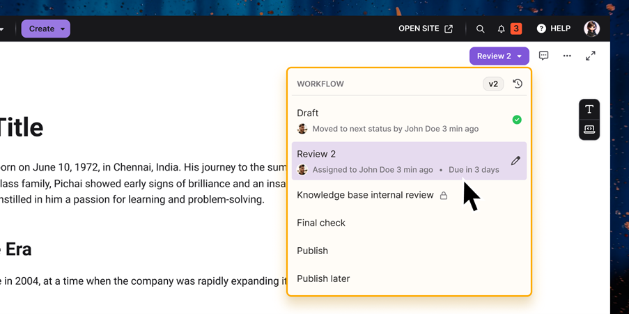
Publishing is a key step in the documentation workflow. Writers push updates, reviewers step in, deadlines are closing in, and somewhere in the middle, articles get lost in a sea of statuses. Is this draft ready? Was that version already published? Why does this one say “new,” and that one “unpublished”? Too many statuses meant too much second-guessing. That’s why we’ve simplified the process and added clarity by redefining the color-coded article statuses. Now, every article tells its story at a glance:
- Drafts show up in yellow,
- Published content in green,
- Unpublished articles in grey,
- And stale drafts in orange to signal that action is needed.
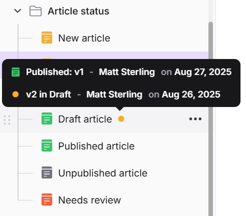
Even when a published article is forked, it keeps its green article icon, while a small yellow dot next to the title shows there’s a draft version in progress, complete with the contributor’s name and the date. No confusion, no digging around.
And to guide you through the workflow itself, the Publish button now directs you towards the next step. Instead of simply pushing content live, it shows you the next step: assign someone, set a due date, add comments for context, and push it to the next state with confidence. This results in a workflow that helps you collaborate better. Clear statuses, straightforward steps, and fewer cracks for quality to slip through.
Keeping track of article details is important, not only for writers but for the entire documentation ecosystem. The new Article information icon in the top navigation bar puts everything in one place: slug, description, status, version, contributor activity, and even the full breadcrumb path for articles that are deeply nested. This helps you spend less time hunting for details and gain more confidence that your content meets your organization’s optimization and compliance standards.
Simplify your documentation workflows with Document360. Try it today!
GET STARTED
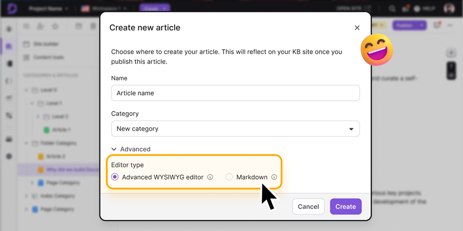
Create Articles with Your Preferred Editor
Not every article is created the same way, and not every writer works the same way either. Some prefer the flexibility and precision of Markdown, while others need the rich formatting of Advanced WYSIWYG. Until now, switching editors wasn’t exactly simple. You had to set it at the project level, and changing it for a single article meant clicking through multiple settings, and hunting down the right option was a process that took far too long.
With this update, that friction is gone. You can now choose Markdown or Advanced WYSIWYG right when you create a new article. No extra steps, no detours. It’s flexibility where it matters most, giving writers the freedom to work with the editor that suits their requirements, without forcing an all-or-nothing choice across the whole project.
Better Editors For Your Content Reuse Elements
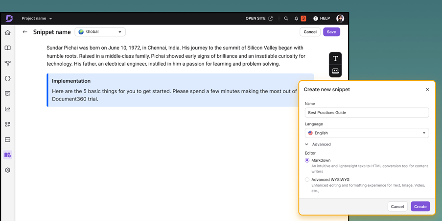
Reusable content should save time. But until now, editing snippets, glossary terms, and variables often felt limiting. Writers missed the flexibility of Advanced WYSIWYG, especially when working with complex formatting or media.
That changes today. Snippets now open in the Advanced WYSIWYG editor, complete with block-level formatting, media support, and intuitive controls like drag-and-drop, insert, and delete. Glossary terms and variables also get a streamlined treatment, with more styling and easier formatting options that make them faster to create and maintain.
And when terminology changes (as it always does), the new Find and Replace helps you update snippets in just a few clicks. No repetitive edits, no wasted time. Best of all, your existing snippets are fully compatible. So, you can start benefiting from the new editor right away.
Give Readers A Smoother Site Experience
With KB Site 2.0, we’re tackling the little frustrations that often get in the way of a smooth knowledge base experience. Branding headaches are gone, too. You can upload separate logos for light and dark themes, and fine-tune icon and text colors in dark mode, so everything feels consistent with your brand identity.
The Table of Contents has also been polished with cleaner formatting and better alignment, making it easier for readers to scan through. To cut through the visual clutter, selected articles and categories now get a subtle background highlight, so visitors always know where they are. And when you share articles privately, your custom CSS stays intact, ensuring your brand identity carries through no matter how or where your content is viewed.
Switch Workspaces Without Losing Context
In Document360, Workspaces often serve as different versions of your documentation. It may be product releases, editions, or branches tailored to specific audiences. Until now, while switching between, readers lost their place and had to hunt for the same article in the new workspace, breaking the flow of exploration.
With this update, that friction disappears. When readers switch between workspaces, they’ll remain on the same article in the selected workspace, making it effortless to compare product versions or navigate parallel documentation sets. If that article doesn’t exist in the selected workspace, they’ll land on the workspace’s main article instead, along with a clear message that explains why, so there’s no confusion.
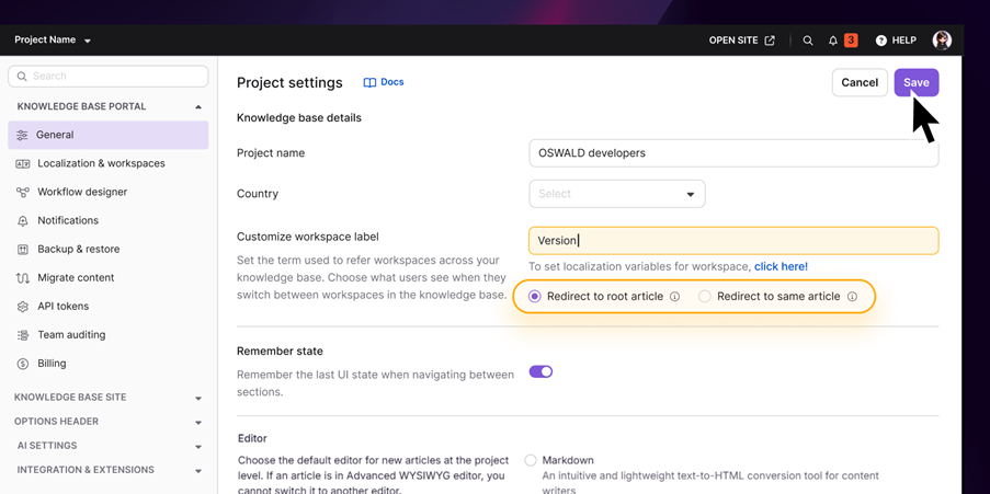
To make the experience feel even more natural, you can customize the “Workspace” label in the portal to match your own terminology, whether it is “Version,” “Edition,” or something unique to your product. The result is a smoother, more intuitive way for users to move across versions and instantly spot what’s changed, without ever losing their place.
Additional Updates
Of course, there are other touches sprinkled in.
- When you clone an article or an entire category within the same workspace, internal links can quickly become a headache. Do you want those links to keep pointing back to the original content, or should they automatically update to the newly cloned version? Until now, you didn’t have much control. This often meant tedious manual fixes or the risk of broken, misleading references.
With this update, you get to decide. When cloning, simply choose whether your internal links should stay anchored to the source articles or update to the cloned copies. This flexibility is especially useful for scenarios like localization, content versioning, or large-scale restructuring, where accuracy of cross-references is critical.
- Eddy AI has always given you insight into the questions your readers are asking, but until now, those queries felt a little anonymous. You could see what was being asked, but not who was behind the question, making it harder to understand usage patterns or tailor content to the right audience.
With the latest update to Eddy AI conversational analytics, that changes. You can now see the logged-in reader’s information (name or email ID) right alongside their query. This visibility is available in private and mixed workspaces, giving you a clearer picture of which users are actively engaging with your AI assistant.
You’re no longer just tracking questions; you’re understanding the people asking them. That means more informed decisions about which content to improve, who your most engaged users are, and where your documentation can make the biggest impact.
Not flashy, but the kind of changes that make the experience smoother every day.
▶ Check out our video on the new personalized dashboards and editor upgrades that make documentation faster and smarter.
Final Thoughts on Streamlined Documentation Workflows
Document360 11.8.1 isn’t just another release with more buttons to click. It’s about removing the quiet frustrations that chip away at your focus. It’s about giving you a dashboard that makes mornings easier, a workflow that guides you instead of confusing you, and a site that makes your readers want to stay.
Because the truth is, documentation doesn’t have to seem like spinning plates. With the right tools, everything falls into place. Try these new features today and tell us what you think!