As a company with multiple products in the market, documentation is vital for us and we had our share of challenges with various documentation platforms.
It was this struggle that led to the idea, why not build a documentation platform ourselves and eventually to the inception of Document360.
So, months after the launch, when we started building Analytics, we were trying to address the key pain points that we ourselves were facing in the past.
A good documentation platform is seen as a tool that helps your customer better understand your product. But, a better documentation platform should help you understand your customers and that’s what Analytics does.
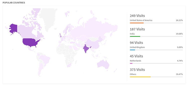
What are your customer demographics?
When your product is used by customers around the globe, it’s trivial to provide adequate customer support.
A Geographical heatmap helps you understand where your customers are from. This helps you better align support hours and efficiently target your marketing campaigns to countries that you get the most visits from.
Which Articles / Authors are generating more traction, and which needs improvement?
Customer feedback lets you know, what you did right and where you should improve. Document360 allows your customers to upvote and downvote articles and giving you insights such as leading article and leading authors.
Simply by using sort you could see which article got the most views, reads, likes or dislikes. This data helps you recognize and encourage authors who write customer friendly articles. Also, to identify which articles need improvement/ rework.
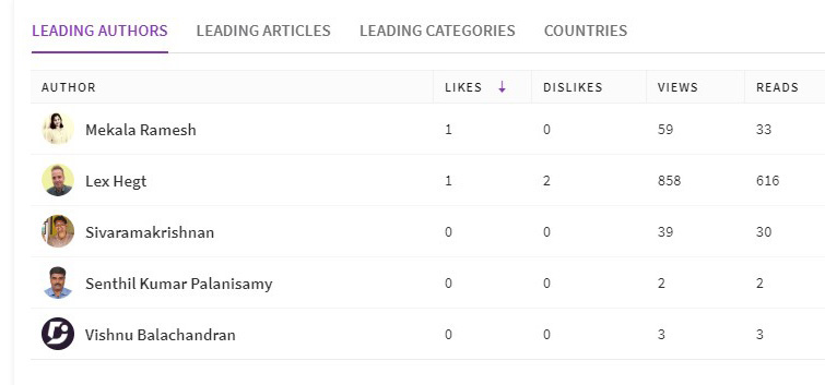
Performance chart shows you the big picture of customer engagement with your KB for a given period. It shows you the total number of likes, dislikes, reads and views that all articles in a project version received per day along with the average time readers spent on an article.
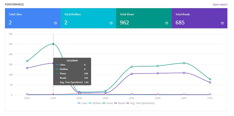
What are the features customers are trying to find in your knowledge base, what are you missing?
One way to know what your customers are interested in is to analyse what they are searching in your Knowledge base.
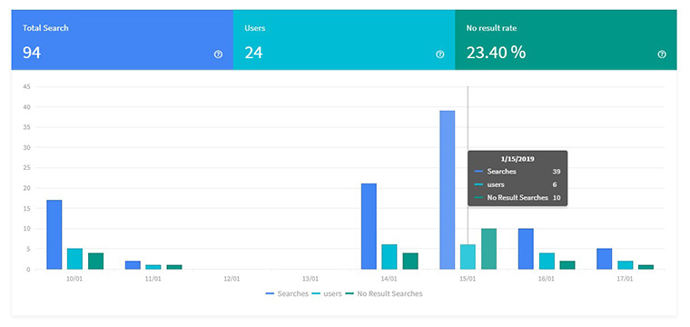
Our Search analytics section tailor-made to assist you with this task. The Search graph shows an overall view regarding how many users used to search in the selected time frame. Also, shows the number of searches they did along with the number of searches that didn’t return any results.
What are the features customers expecting from us that we are currently missing?
The “Popular Searches” table answers the question. It also shows you the number of times the keyword searched over the selected time frame.
The “No Result Searches” table helps you understand what you might miss in your knowledge base and what are the features customers expecting from you that you are missing.
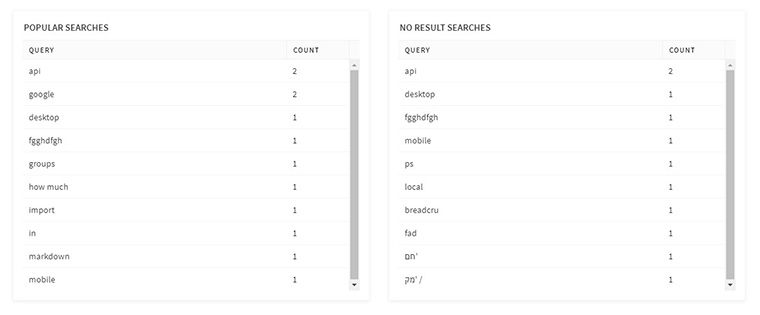
Inputs from these two tables will help you understand customer expectation and plan better for the future sprints.
Also Read: How Knowledge Base Analytics Reshapes Business Strategy for Growth
An intuitive knowledge base software to easily add your content and integrate it with any application. Give Document360 a try!
GET STARTED


 –
– 