EN
EN  SV
SV PT-BR
PT-BR FR
FR ES
ES DE
DE
Introduction
In this post, we’ll do a tear down of Hubspot’s knowledge base for their range of inbound marketing and sales software.
Hubspot dominates in the marketing space. The company was one of the early pioneers of inbound marketing, and credited with coining the term ‘inbound marketing’. Their approach has helped it grow into a company with $375.6 million USD in revenue in 2017 and more than 2,000 employees.
Here We Go with Hubspot Knowledge Base
But is Hubspot as savvy with their knowledge base content as it is with inbound marketing?
As a SaaS company, Hubspot needs to focus on helping its customers get the most out of their subscriptions in the long-term. This objective is, in some ways, even more important than acquiring new customers.
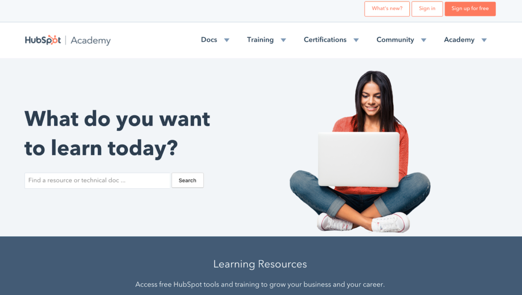
Once users hit the Hubspot Academy site, users have to work out what content is included in the Hubspot knowledge base. It’s a mixture of Hubspot’s marketing ‘certifications’ and user docs.
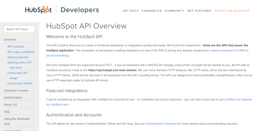
General docs are still hosted as part of the Academy, but Hubspot has separate knowledge bases for designers and developers. The top navigation links out to the other Hubspot knowledge base.
Hubspot Academy is focused on getting users up and running with Hubspot’s tools. HubSpot encourages them to take free certifications. The result is that Hubspot knowledge base is a curious mixture of help content and marketing materials.
Now, let’s take a look at the help content – which is the focus of our study today.
User Guides and Quick Answers
Hubspot divides its help content into:
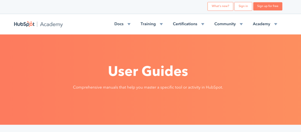
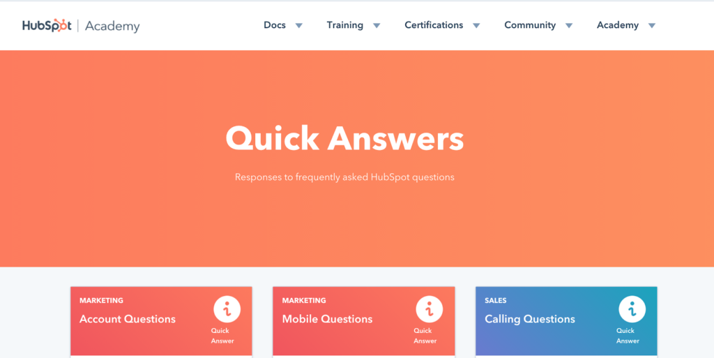
- User Guides (long-form tutorials)
- Quick Answers (shorter content answering one question)
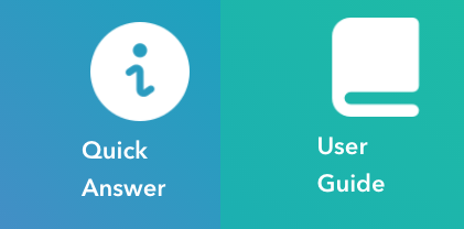
You know when you’re in a particular section based on the brightly colored banner you are greeted with. Hubspot’s User Guides are clearly signposted.
 You see exactly the same banner with different wording in the Quick Answers.
This is important, as it’s likely that when you land on Hubspot’s docs you may not be aware of what you’re looking for.
31% of customers want instant online help. Start with a knowledge base solution
Signup now
Hubspot has to connect its many branches to ensure users are properly signposted. Unfortunately, once they’ve highlighted the section with a heading, they seem to expect their users to read through each content module to find what they need.
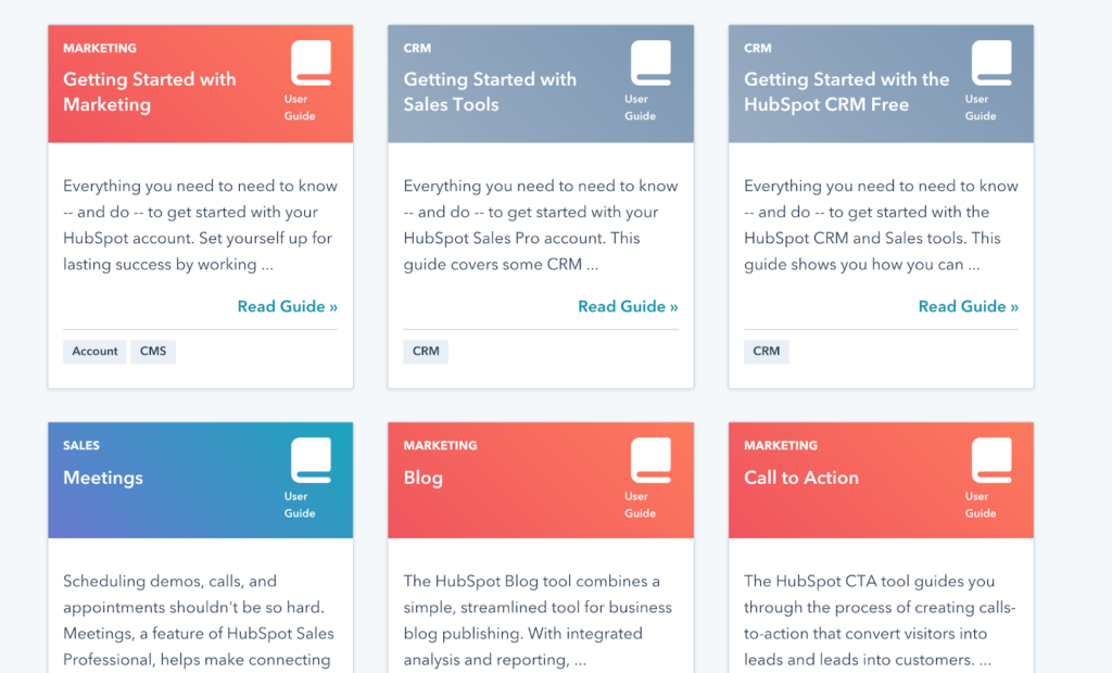
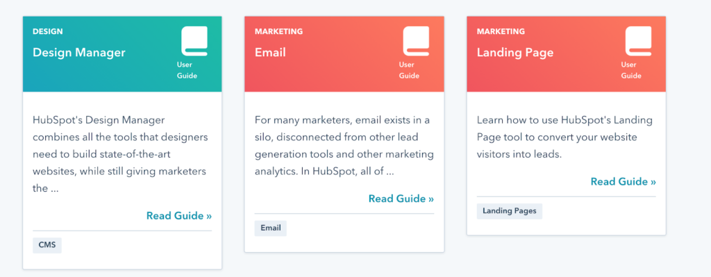
In the User Guide homepage, users are presented with a series of panels with a relatively large amount of text to digest.
 Once you find a guide, you think looks promising. Hubspot’s User Guides are structured with a table of contents linking out to more specific content pages.
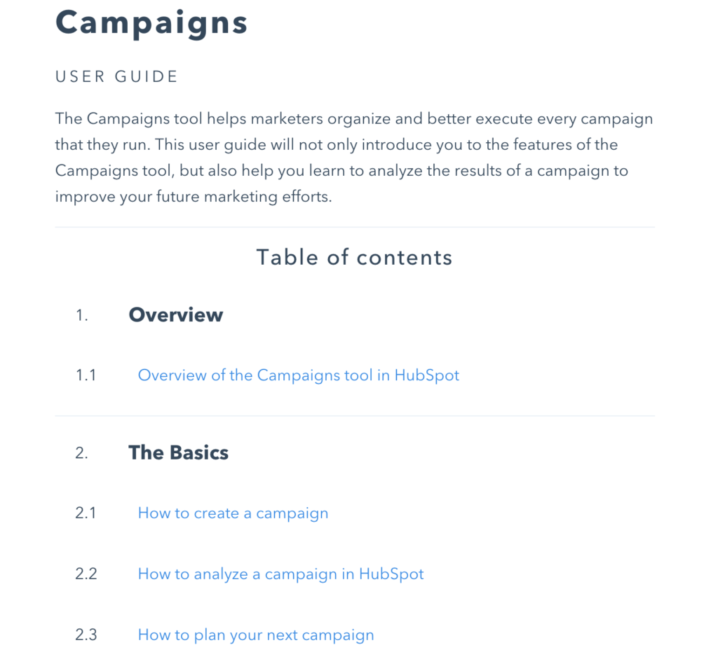
From this table of contents, users can see that there is an array of different content pages they can browse.
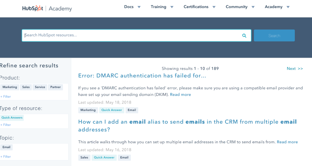
This is in contrast to the Quick Answers, which are simply presented in an unordered list once you’ve clicked through to a category.
It’s clear that Hubspot has presented its content in this way to emphasize search and filtering over Information Architecture – which we’ll go into later.
Visual design and layout
Now, let’s take a look at the Hubspot knowledge base visual design and layout.
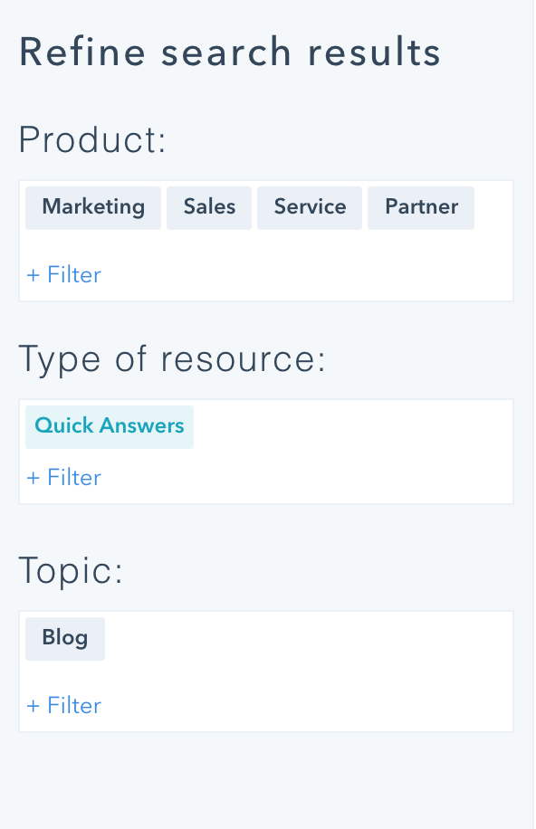
The knowledge base does actually have different colors to signify which category each topic belongs to (Sales, CRM or Marketing for example) but the topics are all mixed up in random order.
Confusingly, the design of the User Guides categories is visually very similar to the Quick Answers, begging the question of exactly what the difference is.
Hubspot should use visual cues like a different color palette, fonts or shapes to tell the user that they are browsing a completely different form of content.
Hubspot could even make the ‘User Guides’ and ‘Quick Answers’ banners different colors to distinguish them. This would instantly improve the design (although they’ve stuck with orange as their brand color).
At the moment, the only visual difference is using a different symbol for each – which are visually not that distinctive, since the symbols are so small.
It’s not necessary for your knowledge base software to be 100% on brand, as long as you host it as a sub-domain or sub-folder of your domain. If you make sure there are at least some visual links with your brand, this shows you own the company knowledge base.
Pro Tip:
In fact, we know that Hubspot is aware of how to do this as this is the style they’ve chosen for their developer knowledgebase.
So, now we’ve covered visual design, let’s move on to Hubspot’s actual content.
Hubspot Knowledge base content
Once you actually dig down into and create knowledge base content, the bright colors are stripped away to reveal a knowledge base that becomes plain and simple.
Hubspot makes good use of screen casts to illustrate their content – for example, how to use Hubspot’s click and collect feature.

Hubspot starts to really shine when it comes to the usability of their content. As pro marketers, the team understands that content needs to be as easy to understand as possible.
Simple and intuitive knowledge base software for your business needs
Learn moreThey use a neutral tone and second person to refer to the user. Break down the content one or two line paragraphs, bullet point lists, subheadings and formatting for emphasis.
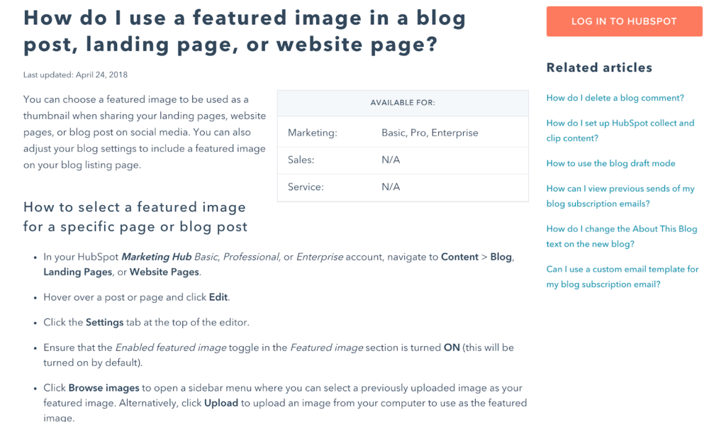
They use a good mixture of detailed written instructions and some screenshots for accessibility.
You don’t want your content to be totally reliant on screenshots as these are not machine readable for users using screen reading software. At the same time, it can be nice to provide imagery to break up the information.
Their content is nothing if not detailed.
Information Architecture/navigation
To put it frankly, Hubspot’s Quick Answers are a long list of topics without any obvious Information Architecture.
You could say that it is a little lacking in IA, and it’s more like a list of forum posts than a sequence of knowledge base articles. It’s not easy to get a sense of how the product structured from this unstructured list.
There is no way that you can really get an idea of what content is contained inside Hubspot knowledge base. You just have to search or click through the pages.
It’s confusing because even when something labelled as a ‘quick answer’ this designation disappears once you get to the content page. The filtering system in the sidebar also disappears and users unable to get the sense of IA or navigation. They must resort to the search bar again.
Pro Tip:
Findability
Information Architecture and navigation is closely related to the findability of your content. Can users browse your knowledge base to discover things they didn’t even know they didn’t know?
Hubspot uses different methods to help users find the content they might need. Hubspot wants you to view their knowledge base like a search engine.
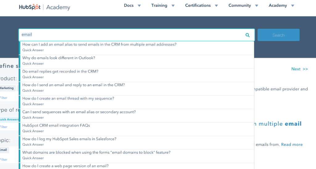
They actually have so much content that they’ve developed a custom search engine to help users search for type of content using predetermined parameters.
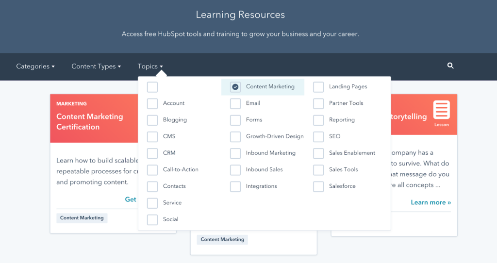 The best way to find their content is through the homepage. You can select parameters from a drop-down menu to help you filter out different content. This is probably how they have chosen to handle presenting so much complex information in a single Hubspot knowledge base.
This is also extended to a handy sidebar at the top level of User Guides or Quick Answers:
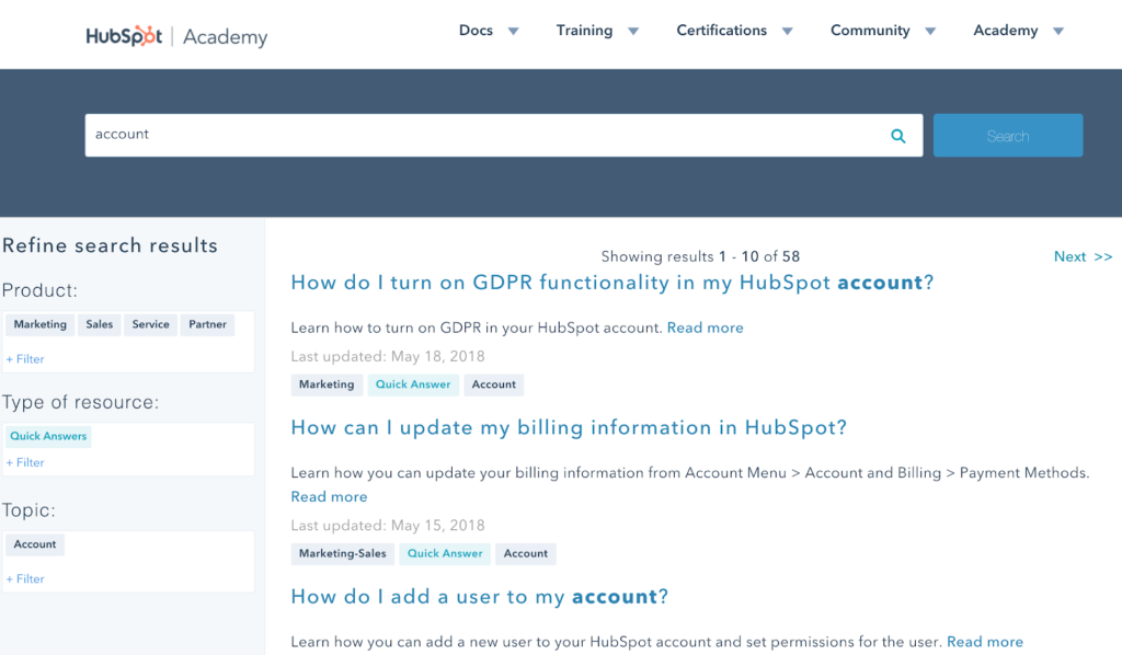
And actually, the search bar contains a long list of auto-suggestions based on what you type to help users discover content.
Pro Tip:
It’s clear that Hubspot will be catering to a variety of use cases. Hubspot’s products aimed at all manner of marketers and business owners, with varying levels of skills in digital tools. This may mean that they need to keep the learning experience as open as possible at the homepage level, so users can orient themselves effectively.
This makes a knowledge base that is bad for browsing, but good if you’re a learner who knows what they’re looking for. Hubspot gets around this limitation by providing related articles on each content page, which may help with discoverability.
User Experience
User Experience is the user’s overall interaction with your product knowledge. It usually involves putting your users first and helping them accomplish their goals – in this case, get the most out of your product.
Make your knowledge base easily searchable on the internet
Get started todayHubspot has its own UX ideas when it comes to its knowledge base. They have a particular funnel they want users to go down based on their marketing objectives. They want users to take their certifications and, ultimately, become a subscription customer.
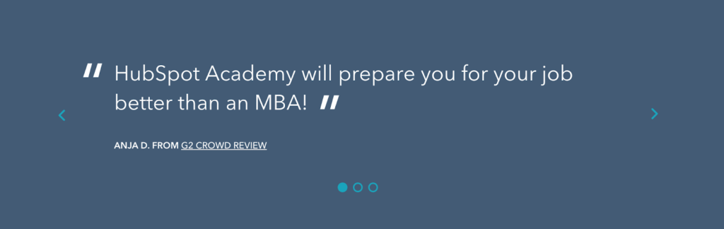
The fact that they include a customer review on the homepage of their knowledge base shows that marketing is at the forefront of Hubspot’s mind (as does the obvious marketing image included on the homepage banner).
To this end, Hubspot has actually designed its knowledge base around product features and internal priorities rather than user experience. Users must fit their desires around what Hubspot’s objectives – instead of having their needs anticipated and fulfilled. You have to know a lot of the jargon that Hubspot uses internally to get the most out of its knowledge base.
Contrast this with a knowledge base like Stripe’s, which immediately highlights the main areas that their customers are looking to discover more about with clearly labelled sections and symbols.
Pro Tip:
It’s knowledge base convention to use large primary symbols on the homepage of your knowledge base. This becomes easy for users to pick a topic area they want to browse. This approach also hints that there will further information contained within these categories. It represents the features of your application or product in visual way so users know there is more to discover.
Then, once users click through to your categories, don’t have include too many articles in a long unordered list as this will only be intimidating. Limit your list to fewer than ten, and keep visual stimulation to a minimum.
Search Engine Optimization
Hubspot is very good at helping users externally discover content and driving traffic to its knowledge base solutions.
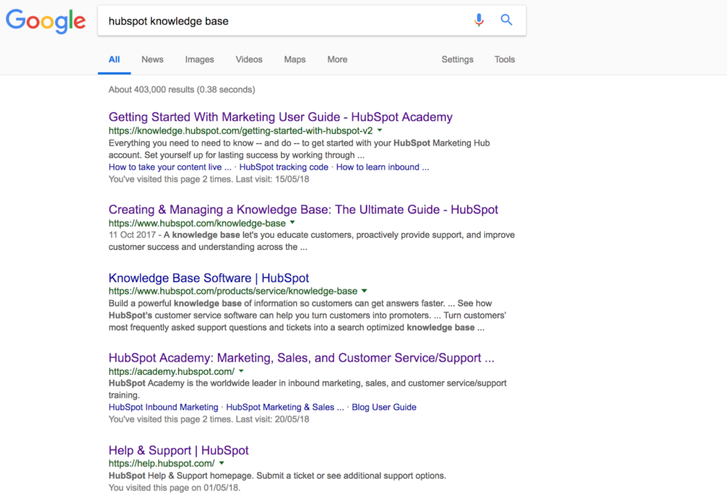
The Hubspot knowledge base is fully indexed in SERPs – and you wouldn’t expect any less from these inbound marketing pros. They have put a lot of effort into optimizing their knowledge base for search engine visibility.
What this shows is that Hubspot has focused more on external indexability than internal discoverability (although they’ve made a good stab at the latter). This makes sense considering the nature of their products is sales and marketing.
Hubspot has combined its help content with content marketing – that’s why their knowledge base structured around their free certifications designed to attract inbound customers.
Hubspot is a marketer, first and foremost.
Top takeaway tips
Don’t focus too much on the shiny exterior at the cost of internal User Experience. These don’t have to be mutually exclusive, but you will reward your existing customers by making it easy for them to find what they need – and reap the benefits with repeat subscriptions.
Hubspot is an example of a company dominating its industry and their content reflects their level of expertise. At times difficult to grapple with, they’ve nevertheless done a good job of presenting complex content for a variety of different use cases.
Here are some top takeaway tips based on Hubspot’s stellar example:
- A well-developed Information Architecture will help your users get to grips with your content and product features.
- A good search function or sophisticated filtering system will help users to discover content buried in your knowledge base.
- Use suggested articles on your content pages to help users find what they need.
- Screencasts are a simple, non-resource-intensive way to bring your content to life.
- Your knowledge base doesn’t have to be 100% on brand with the rest of your website. It should place the focus on the learning experience.
- Use different colours and other visual cues to tell users they are in different parts of your knowledge base.
- Use helpful, overarching categories with large symbols to help users get a feel for the product features that you offer.
Conclusions
Unfortunately, users need to memorize the layout of Hubspot’s knowledge base to really take charge of their own learning experience. This creates a mindset of defying Hubspot’s predefined objectives and a negative learning experience.
Don’t make this mistake with your knowledge base.
If you liked this post, you can check out our comprehensive tear down of Stripe’s legendary developer knowledge base.
Also, if you think we might have missed something. Or you would like us to analyze other companies’ knowledge bases, let us know in the comments section below.